Designing for Change
In a world where technology evolves at breakneck speed and societal challenges loom large, the question arises: How can we harness the power of design to create meaningful change? This blog post explores the intersection of design justice, equity-centered innovation, and personal growth, offering insights into how we can shape a more inclusive and empowering future.
The Vision: A World United by Humanity
Breaking Barriers, Building Bridges
Imagine a world where equality transcends race, caste, sex, and ability—a community united by our shared humanity. This isn't just a utopian dream; it's a vision that drives innovators, designers, and changemakers worldwide. As we stand on the cusp of a new era, the potential for positive change has never been greater.
The Digital Renaissance: A Double-Edged Sword
In mere decades, we've witnessed a technological revolution that has reshaped our reality. From room-sized computers to pocket-sized marvels, technology has woven itself into the fabric of our lives, connecting billions and redefining how we work, learn, and interact. Now, with the dawn of artificial intelligence, we're peering into a future brimming with possibilities.
This digital renaissance holds the promise of:
Democratizing knowledge
Accelerating innovation
Empowering individuals to tackle global challenges
Yet, as we embrace these advancements, we must remain vigilant. The same tools that can elevate humanity can also deepen divides if not wielded responsibly.
A Theory of Change: From Vision to Reality
The Cyclical Path to Progress
My journey in pursuit of equitable change has led me to develop a theory of change—a roadmap for turning ideals into tangible outcomes. This framework proposes that sustainable societal progress unfolds through five interconnected stages:
Community Understanding: Deeply empathize with community suffering and identify critical gaps.
Solution Development: Create a universally applicable framework to address identified issues.
Implementation: Apply the framework broadly, beyond a single community.
Continuous Adaptation: Regularly validate and refine the framework against emerging trends, challenges, and societal shifts.
Iterative Improvement: Evolve solutions to remain relevant and effective in addressing current and future problems.
This cyclical process isn't just a theory—it's a living, breathing approach that drives ongoing human advancement by ensuring responsive, impactful interventions across diverse contexts and changing times.
The Power of Design: Shaping a Better Tomorrow
Design Justice in Action
At the heart of this journey lies the concept of design justice—a powerful framework that aligns perfectly with the goals of equity-centered innovation. By embracing design justice principles, we can:
Use design to sustain, heal, and empower our communities
Prioritize design's impact on the community over the intentions of the designer
Recognize everyone as an expert based on their lived experiences
Share design knowledge and tools with our communities
These principles remind us that true innovation isn't about creating flashy solutions; it's about empowering communities to solve their own challenges.
Education as a Catalyst for Change
My experience at Austin Center for Design (AC4D) has been transformative, providing not just knowledge but a new lens through which to view the world's challenges. It's here that I've learned to challenge assumptions, dig deeper into community needs, and craft solutions that are both innovative and deeply rooted in equity.
From Theory to Practice: A Personal Journey
Bridging Business and Social Impact
Inspired by the potential for change, my sibling and I embarked on a business venture with a dual purpose: to create beautiful bespoke lighting and to elevate the community of handicraft artisans. This endeavor has shown me firsthand how design thinking can transform lives, turning skilled craftspeople into recognized designers and artists.
The Evolution of Change-Making
As I've grown in my understanding of design justice and equity-centered innovation, my approach to change-making has evolved. I've learned that:
Small efforts can indeed lead to significant change
Empathy and deep understanding are crucial first steps
Long-term, empowering solutions are key to sustainable impact
Systems thinking is essential for addressing complex societal issues
Looking Ahead: The Continuous Journey of Innovation
Embracing Complexity, Fostering Collaboration
As we move forward, it's clear that the path to meaningful change is neither straight nor simple. It requires us to:
Challenge ourselves and our assumptions continuously
Build ethical frameworks for problem-solving
Prioritize relationships and diverse perspectives
Trust in the process, even when progress seems slow
By embracing these principles and remaining committed to equity-centered design, we can create innovations that not only solve problems but also empower communities and foster lasting change.
A Call to Reflection
As we conclude this exploration of design, justice, and innovation, I leave you with a question to ponder:
In a world where technology and design shape our daily lives, how can we ensure that our innovations not only solve problems but also address systemic inequities and empower the most marginalized among us?
Your answer to this question could be the first step in your own journey towards creating meaningful, equitable change through design. Remember, every great innovation starts with a simple yet profound question. What will yours be?
Transformative Learning: My First Week at Austin Center for Design
Design has the power to reshape our world. It's not just about creating aesthetically pleasing objects; it's about understanding human needs, diving deep into complex problems, and crafting innovative solutions that enhance lives. This perspective drew me to the Austin Center for Design (AC4D), where I recently completed my orientation week. Let me take you through this enlightening journey that has already begun to transform my approach to creative problem-solving.
Setting the Stage: The Power of Design Thinking
Before delving into the specifics of the orientation week, it's crucial to understand the context. Design thinking, as a methodology, has gained significant traction in recent years across various industries. It's an approach that puts human needs at the center of problem-solving, encouraging empathy, creativity, and iterative thinking. AC4D's program is built on these principles, aiming to nurture designers who can tackle complex social and business challenges.
Day 1: Embracing Empathy Through Research
Our orientation kicked off with an intensive focus on research and empathy - the cornerstones of effective design. We were immediately challenged to identify specific focus statements for potential design problems. The key lesson? Suspend your biases and approach each problem with genuine curiosity.
We conducted interviews to gather user perspectives, and it was eye-opening to see how each interviewee brought a unique story and set of challenges to the table. This exercise hammered home a crucial point: effective design solutions stem from a deep understanding of diverse user experiences.
Day 2: The Art of Synthesis
Armed with a wealth of interview data, we moved into the synthesis phase. Using digital collaboration tools like Mural Board, we organized our findings and began to identify patterns in user behaviors and pain points. This process was both challenging and rewarding, as it required us to step back and view the data holistically.
The synthesis phase highlighted an important aspect of design thinking: the ability to find commonalities in seemingly disparate information. It's these common threads that often lead to the most impactful insights and solutions.
Day 3: Generating Actionable Insights
As we progressed to insight generation, we experienced firsthand how structured research can challenge and often overturn our initial assumptions about a problem. By putting ourselves in our interviewees' shoes, we gained a deeper empathy for their situations and a clearer understanding of the true issues at hand.
This phase emphasized the importance of letting the research guide our thinking, rather than forcing preconceived notions onto the data. It's a skill that I believe will be invaluable not just in design, but in any problem-solving scenario.
Day 4: Bringing Ideas to Life Through Wireframing
The week culminated in an energetic wireframing session led by Josh Wright. We started with playful exercises, like sketching our dream pets, which served as an excellent ice-breaker and creativity boost. From there, we delved into the technicalities of wireframing, learning about different fidelities and rapid ideation techniques like Crazy 8's.
It was fascinating to learn that these methods are used by industry giants like Google. The hands-on experience of visualizing user journeys and designing layouts gave us a taste of how professional designers bring their ideas to life.
Looking Ahead: The Journey of a Creative Problem Solver
This orientation week at AC4D was more than just an introduction to a program; it was the first step in a transformative journey. We've been equipped with foundational skills in empathy, research, synthesis, and visualization - tools that will undoubtedly prove valuable in our future careers as designers and problem solvers.
As we move forward in the program, I'm excited to build on these skills and apply them to real-world challenges. The week has reinforced my belief in the power of design to create positive change, and I'm eager to see how we can leverage these methodologies to address complex social and business issues.
For anyone considering a career in design or looking to enhance their problem-solving skills, I highly recommend exploring design thinking methodologies. They offer a structured yet creative approach to tackling challenges, with the potential to drive meaningful innovation across various fields.
As we continue our journey at AC4D, I look forward to sharing more insights and experiences. Stay tuned for more updates on our adventures in creative problem-solving!
Into the Unknown (and Back Into the Known) - the AC4D Experience
From early childhood, many are asked “What do you want to do/be when you grow up?”. But maybe it’s not as simple as that. For me, it’s figuring out what brings me purpose. Talking to and immersing myself in the presence of vulnerable subject areas immediately fires the engines in my brain. I love diving head first into a problem, brainstorming all of the many ways to “solve”, and even how to make it look good in the process. A little cherry on top.
The AC4D experience is just that and more. By taking part in this 9 month immersive experience, I plan to take my design thinking and skills to the next level.
One thing I loved immediately from this week was meeting new people and the many perspectives/insights my classmates and mentors had to provide. Anxiety around meeting new people and working in groups washed away with the friendly faces I was met with. The instructors were very articulate and knowledgable, and the women I’ll be working with cultivate a friendly challenging environment that gets me excited for the year to come.
The first day was met with friendly faces, fun icebreakers, and then diving right into software and the assignment for the week. We were to interview 4-5 people on the topic of mental health equipped with a dialogue to encourage an organic conversation. I had previously done the 12 week Immersive Design Research Remote Studio after this session of the 9 month Immersive studio got delayed. With that under my belt, I had a little bit more of a sense for what to expect for the design process as a whole.
Returning to design research reminded me how much more I needed to grow, that this was only the beginning if I want to become strong in this field.
Going forward, we used our interview notes and the 15 minute transcription to begin synthesizing our collected data. This is where the fun begins. Gathering utterances to find a collective theme, then asking yourself “Why does this work? What makes these points similar, and why?”, was the beginning of the process. It truly felt like dumping my brain out on Mural and taking a string to each point, creating a Jackson Pollock piece out of the mess. When it came to creating insights, I felt absolutely lost again. This piece of design research was a step I initially struggled with during the shorter experience I had with AC4D. Revisiting this step was just a reminder that this was just the beginning of my journey and I had more time to ask questions and practice this process so I can eventually own my knowledge.
The next day was definitely more hands-on. The first exercise was coming up with design solutions for the prompt provided. We wireframed different screens, highlighted some of the features we wanted to hone in on, and produced two higher fidelity screens. Using Figma helped bring our selected to another level of fidelity and gave us practice using one of the programs current in the world of design and a tool used throughout this curriculum. Chasing the thrill of creating and re-working rapidly over your project is what fuels my love of design.
To wrap up this week of new and revisited Design thinking, we had the privilege to pick the brains of some Alumni. Hearing their different perspectives on the experience as a whole and what to do after the program provided insight on the year ahead of us.
I’m ready to grow as a designer, a teammate, and as a problem solver.
Orientation Week Insights: A Journey of Learning, Engagement, and Discovery
I didn’t give much thought or ask anyone about what to expect for orientation week, but it turned out to be a fun, engaging, and intensive learning experience.
The first day kicked off with introductions to my fellow classmates and a sneak peek into their interests. I loved learning about the people with whom I will be on this journey for the next year.
We then jumped right into understanding what design is and the first step in the design process: research. What stood out to me was the incorporation of ChatGPT as a thought partner for narrowing down the focus area of research, generating focus statements, and creating interview questions throughout the day. It was great to see that the school is making an effort to introduce the latest technology and prepare us for the workforce in the best way possible. This reaffirmed my decision to pursue this one-year program alongside my full-time job.
By the end of the day, I realized that I had to interview five people the next day as part of the learning experience. This caught me by surprise. I knew that design thinking emphasizes “learning by doing,” but I didn’t expect to jump into action so early in the process.
I was excited to see what the outcome would be and spent the next day interviewing people about the “Effect of Social Stigma on Help-Seeking Behavior for Mental Health and Well-Being.” I learned unexpected things and went off-script for most of my interviews. I returned to class on the third day thrilled to learn what we would do with the data collected.
The best part was not just sharing and reflecting on the process each day but also hearing about my classmates' experiences and learning from them. Along with learning about the design process, I experimented with sketchnoting during class. This made the sessions even more engaging and helped me stay focused.
Day three was the best of all and will be memorable for a long time. We spent the class learning about the synthesis step of the design research process. The key learning aspect for me was witnessing the power of externalizing our thought process. I have always been someone who processes things internally, but during the class, we identified themes in the data collected and drew insights from those themes. As I internalized the information, I had thoughts about the themes that emerged and their underlying reasons. When everything was visually in front of me, and I had to externalize by identifying themes, writing them down, and asking why to draw insights, I discovered deeper, more meaningful insights. This was an "aha" moment for me.
This class was memorable not just for this reason but because working on drawing themes and insights has been one of the most enjoyable moments ever. I had a lot of fun learning and doing it. In that moment, I felt that I was a step closer to identifying my next career path.
Day four was about prototyping and making the insights and solutions we identified tangible. We started by learning about wireframes, then jumped into hands-on sketching on paper, iterating, and had a quick tutorial on Figma. What was great about this day was seeing the value of coming up with many possible solutions in a short period. Each solution may not be perfect, but we need just one at the end. The beauty of this process, as I learned, is that we can pick the best elements from all options to form our final solution.
Day five was the Alumni Q&A. I enjoyed hearing from the program's alumni about their experiences with AC4D, how it has shaped them, and their career trajectories. As I listened to their journeys, I couldn’t help but wonder where I will be a year after the program, and can’t wait to find out!
Overall, orientation week kept me happily busy, and I hope the next year will be just as engaging and fulfilling!!
One Village
One Village aims to revolutionize food donations in Austin by connecting community fridges through a user-friendly web app, enhancing both contributions and community bonds. This student-led initiative showcases the power of digital innovation in addressing local food insecurity issues.
Validating Our Concept
Background
For the last two quarters, a small team of myself and two other designers wanted to better understand the barriers people with food insecurity are facing to access affordable food and the impact of this on their lives. We conducted contextual interviews and a relational mapping activity with subject matter experts in local government, organizers of different food assistance programs, and people within our community experiencing food insecurity to better understand:
Ways in which food surplus/waste can be redistributed to people experiencing food insecurity
Our objective is to explore access to a variety of food options for individuals who experience food insecurity.
To understand the accessibility and preference for fresh foods, prepared foods, and canned foods, etc.
Free Fridge
We learned that while there are a lot of great organizations providing access to food in Austin they can be confusing and difficult for people in extremely difficult situations to access. We quickly identified the ATX Free Fridge, a Mutual Aid organization, as an low barrier program for people to access food. In our research, we learned these fridges were inconsistently full, which creates a new barrier for those experiencing food insecurity. We heard from fellow community members and organizers that while there is no shortage of people interested in helping in our community, people often can give from a misguided place, donating and volunteering can be inconvenient, and people can be too burnt out from their own day to day lives to turn thought into action.
With our learnings in mind, we began ideating possible solutions with the following question: how might we make it more convenient, social, and scalable for people to contribute to community fridges, to improve consistency of food access?
One Village Story Board
Our answer was One Village: a web app to help community members donate more efficiently, while fostering connections within the local community.
We had plenty of hypotheses about why this would meet the pain points we initially heard about from our research participants, but we had yet to confirm these with real people.
Experiment 1: Our killer assumption
We needed to test our most lethal, killer assumption first: did people really want to use One Village? To test this we asked our Free Fridge partner to post a survey we wrote to their Instagram page gauging the Free Fridge followers interest in receiving a suggested weekly grocery list of items needed at the Free Fridge, frequency of reminders they’d like, and whether or not they’d want assistance in getting food to the fridge. We
Instagram post
Our metric for success was receiving 25-50 responses, however, 148 participants within 24 hours, with others requesting to be added to the list after.
In addition to validating the desire for One Village, we also learned some important things about our user base:
People are interested in recurring notifications
People prefer to drop off their donations
People are not interested in sharing their location
When participants want reminders
Experiment 2: Differences in donations
This experiment was important in validating our hypothesis that people will purchase items off a provided grocery list and donate them to the Free Fridge. We broke up the contact information provided by our survey participants and divided them into groups, to receive either a specific list or generic list of things to donate. We asked they reach back either by email or text with a picture of what they donated, and their fridge location.
Text messages to participants
We soon realized that asking for participants to send us a picture was actually requesting two behavior changes: people were used to interacting with the Instagram page and had been sending pictures and confirmation to the page. We got in touch with the Free Fridge organizers and requested they forward any donation confirmations overlapping with the lists.
Through this experiment we learned a little more about our users:
There is a preference for specific lists over generic lists
Texts lead to more engagement over emails
Experiment 3: Social Engagement
This experiment was focused on proving whether we could leverage storytelling and social connection through recipe sharing to increase home-cooked meal donations at the fridge and increase feelings of connectivity.
Messages sent out
We included a message to our existing user base providing an easy pasta salad recipe and them to cook a little extra to donate to the Free Fridge. Our success metric used was 3+ users making the recipe and sending us confirmation. This experiment has yielded no responses or evidence of people participating, and has effectively invalidated this method of leveraging connection. We either need to focus more on storytelling and
Reflection
This period of rapid experimentation has been incredibly rewarding. The combination of general success and validation of our work these last six months in tandem with the gratification and joy of seeing people giving has been incredible. I feel confident that our concept is on the right path, given the outcome of our first two experiments, but I do feel some uncertainty about the third. I think our method of leveraging social participation didn’t relate enough to our findings and what we know works: shared social identity and storytelling. I’d like to go back and play with both how we measure how our participants feel about different methods of social leveraging vs whether the amount of donations increases given social participation. With hindsight, I feel this experiment didn’t give us a clear understanding of anything, except that people didn’t want to make pasta salad this week.
Rapid Experimentation: Finding the right path for Money Talkss
AC4D students developed "Money Talkss," a project focused on enhancing financial discussions among couples through rapid experimentation, revealing the importance of gameplay and targeted questions in facilitating meaningful conversations.
A reflection on finding the right way to approach your target users.
Overview
In March 2023, my classmate and I embarked on a project with a shared goal: to explore people's beliefs and values concerning money.
After conducting numerous interviews, we initiated the process of charting people's evolving relationships with money across different stages of life.
Finding a pattern
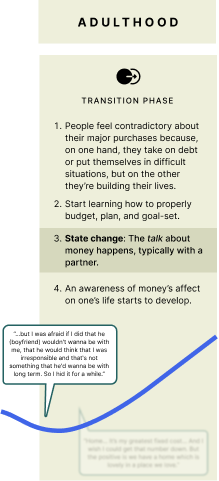
As we spoke with people and begin mapping out their relationships with money, we saw a trend. When people reach adulthood, they go through a transition phase: Being conscious about their financial circumstances.
People had a hard time opening up about money to others, let alone their partners.
When we dived deeper into the subject, we discovered that the root cause of this difficulty stemmed from a deficiency in certain key skills. These skills, we found, were often lacking due to emotional, educational, or upbringing challenges.
This discovery led us to realize there was something to be solved around helping couples talk about money.
Solving it the right way
We now knew what the goal of our product was, but we faced the challenge on how to do it. We ideated and iterated several times during Q3 until we found what worked best for our participants.
A fun, light-hearted way that can help couples talk about difficult subjects such as money.
Experiment 1: Fake Door Experiment
We built a landing page, where we described the solution and added a Wait List section, assuming users would be interested enough to sign up and try it out.
Our success criteria was that out of all traffic, we would have 10% of it sign-up.
Shared across dating subreddits, finance oriented communities and social media.
We saw low engagement and started iterating upon it, so it felt almost as if we were doing SEO and optimizing a landing page.
It failed, out of 329 unique visits, we got only 1 sign up.
What we learned
When we had this experiment live, we spent a big chunk of time iterating and optimizing it, so it almost felt as if we were doing SEO and Marketing to improve conversion. Looking back this time would’ve been better spent doing other experiments.
Experiment 2: Usability testing
We went back to basics, decided to just focus on the game experience, created 5 questions around Abundance, a financially related topic that can have some nuances as we’ll see later.
For our participants, we focused on couples that were dating for less than 2 years.
Reaching out to the awesome AC4D community, friends and family, we were able to set up 5 sessions in a few days. Mind, this sessions required to have both partners on the same time slot, so scheduling was a bit hard, but thankfully we were able to make it work. Testing was both in-person and remote, across the US and Peru.
What we tested?
As I mentioned earlier, we decided to focus our first iteration of the game on Abundance, so we created a set of cards that started light, had a peak depth question and a prompt to ease the couple out of it.
This is what the game looked like, for both physical and digital.
What we learned?
Couples wanted a way to choose the depth of the questions, so if they’re looking to have a casual or a more serious conversation they would like the option to choose.
Also, we saw Abundance not being interpreted solely as a money related subject, but rather, as what they wanted Abundance to be, for some was money, for others, time and love.
I was surprised to see couples gaze into each other while asking questions but also after answering them. I believe the questions we provided were strong enough to increase that interest when couples were sharing stories to one another.
What’s next
As we reach our final presentation, we want to broaden the set of questions to do some further questions, and also, provide some sort of control on the depth of the conversation, so couples know what they’ll be facing when they start playing.
Looking back
I takeaway the fact of being conscious with time when rapid experimenting. Not marrying the idea as we did with our landing page.
And also, a note to myself: Don’t be afraid of trying! Feel comfortable with failure, as long as you action upon it, you will always learn something, I think that can be applied to my whole AC4D experience, no matter how tough things can get, try to get the most out of it. As long as you learn and iterate, you’ll find the right path, always.
Rapid Experimentation for One Village
In their capstone project, AC4D students conducted a series of experiments for "One Village," aimed at enhancing the effectiveness of food donations in Austin. Their findings emphasized the importance of specific donation lists and text-based communication to increase engagement and contributions to community fridges.
Background
Over the past six months, myself and two other students have been researching the problem space of food insecurity in Austin, TX. According to the USDA, food insecurity is defined as "a lack of consistent access to enough food for every person in a household to live an active, healthy life." Research has shown that 1 in 7 people in Travis County experience food insecurity and Central Texas has a higher percentage of food insecure households than most of the country.
People experiencing food insecurity face numerous barriers when seeking assistance. Our research led us to identify the ATX Free Fridge, a Mutual Aid organization, as an effective way to directly help those experiencing food insecurity. The ATX Free Fridge reduces barriers to access by not requiring individuals to meet any qualifications to receive assistance.
While the Free Fridges are a way to directly help individuals in need and strengthen the community overall, they are often times empty. We found this is due to people dropping off expired foods, it not being convenient, and it being hard stay motivated and take the time to help.
Two Free Fridges in Austin, TX
After conducting research and brainstorming possible solutions, we developed One Village, a product that aims to help others while fostering connections within the local community.
High-Fidelity of One Village, the concept we are testing.
Next, we focused on determining if our idea would be something that people would actually want and use. To test this, we devised a simple way to gather feedback before investing significant time, money, and effort into the final project.
As we planned how to conduct rapid experiments, I felt a sense of excitement and optimism, knowing that our approach could alter the course of our project and being open to that possibility.
Experiment 1: Unveiling Interest and Engagement
Our initial experiment tested the deadliest killer assumption: is there interest in our idea? We hypothesized that people will opt in for reminders about donating to the free fridge and will appreciate education about what items are specifically needed. Depending on the results of this experiment, our subsequent experiments or product idea may change entirely.
We conducted a survey to gauge interest in receiving a weekly grocery list of items needed at the Free Fridge. We obtained feedback on this idea from the existing ATX Free Fridge network and measured the response rate as the number of people who signed up for this feature.
Initially, we anticipated receiving 25-50 responses; however, we were pleasantly surprised to receive 148 participants within 24 hours.
Survey results for how often people wanted reminders
Survey results indicating drop off preferences
Our learnings after running this experiment were:
People reported wanting to drop off donations themselves.
Of the 148 participants, 65 preferred weekly reminders and 70 preferred monthly reminders.
Participants preferred sharing their email address rather than their phone number.
Through this, we learned that one of our main features, drop-off locations for donations, was unnecessary at this time as people reported wanting to drop off donations themselves.
Experiment Two: Fine-Tuning Donation Triggers
Experiment two aimed to determine whether providing specified donation lists would encourage people to contribute more often. We provided a mix of specific lists (oranges, broccoli, etc.) and generic lists (vegetables, fruit, etc.). We asked people to send us texts or emails when they donated.
Midway through the experiment, we realized that familiar donors were engaging through ATX Free Fridge's Instagram rather than reaching out to us. This prompted us to adjust our tracking methods. The ATX Free Fridge would send us donation confirmations when they aligned with what was included on the list.
Seeing donations rolling in was really exciting. However, it required a lot of work to ensure that we were texting the correct people the correct lists. The organization of who was texting and emailing whom required a lot of coordination. Luckily, one of our teammates was very skilled in Google Sheets, which helped with organization.
Our learnings after running this experiment were:
Preference for specific lists over generic lists
Texts lead to more engagement over emails
Half of the confirmations were shared over Instagram
Through tracking donations, we found that the lists were helping people and encouraging new donors to contribute to the fridge. This success led to the decision to move forward with texting lists about what is needed for the fridge, and to look into text automation services for the future.
Texts to and from our participants— showing recommended lists and donations
Experiment Three: Cultivating Engagement Through Recipes
For experiment 3, our assumption was that people would want to connect more with those they were helping and sharing co-created recipes alongside storytelling would increase their motivation and connection to the cause.
To test this assumption, we began by asking if people would even spend extra time cooking for the Free Fridge. We provided a simple recipe and asked people if they would cook a meal this week instead of donating items.
The experiment involved sending out a request along with a short recipe, and the metric used was how many people made the recipe and sent a confirmation of doing so (text or photo). The group also conducted A/B tests, comparing recipe requests versus requests for home-cooked meals, as well as grocery list-based donations versus home-cooked donations.
As of now, we have not received any feedback about people making the home-cooked meals.
In retrospect, we feel like this was not the correct method of testing our initial assumption, as we wanted to know if this would build a connection and increase motivation, rather than simply if people would spend extra time for the cause. Moving forward, we believe we can devise a new experiment that better supports our hypothesis, potentially emphasizing the storytelling aspect more than the recipe itself.
Conclusion
Over the course of several experiments, we have gained valuable insights into how to improve our product, One Village. Through these experiments, we have learned that suggested, specific donation lists hold immense value and that text-based communication and curated, specific lists are key components that demand focus. We were surprised to learn that people do not care about having a drop-off location, which has helped us to further refine our approach.
Moving forward, we want to test our concept with people who are accessing the resources from the fridge to see how we can better design for their needs, figure out how to better concept test for how storytelling can improve motivation, and research third party, automated texting services
Overall, the process has been exciting, and we have been fortunate to have some successes along the way. Our experiments have reshaped our concept of engagement and donation strategies, and the insights have given us confidence and direction to help us to create a product that truly meets individuals needs.
Q2: Sprinting a Marathon
Wow. Well, Quarter 2 felt like sprinting a marathon. And after documenting everything we did in just eight (8) weeks, it’s very obvious as to why:
~13 formal and informal presentations, multiple rounds of iterations, 1 soft pivot, learning a brand new tool (Figma)... and this only includes what we did in 2 out of the 3 classes!
Sprinting a marathon: the newest Olympic sport.
Let’s take a proverbial lap and explore the past eight weeks, diving into what I did and why I made the decisions I made.
Week 1: Week 1 is actually a facade. Coach is making us think that we were going to have it light by only doing 1 warm-up lap. Silly us.
In our Designing Structures and Systems class we start learning about Service Slices (which, by the way, feel like Calculus visualized), and we’re tasked with identifying a local service we want to evaluate, one that also has a digital component.
I choose Summer Moon Coffee for two reasons:
There’s a location attached to Common Desk where we co-work out of, plus there are 3 locations within 10 minutes of my house in South Austin. (Convenience, I choose it out of convenience.)
In all actuality, I love Summer Moon. In my opinion, their coffee is the best coffee in Austin. I bring out-of-towners there just to brag. Plus, I like supporting local companies that focus on quality products and services. Easy choice.
I then go to 3 locations, those closest to home, with my Contextual Inquiry script in hand, and talk to 5 different employees about the Summer Moon experience. Luckily, I catch them in the afternoon when their respective shops aren’t too busy, and they’re open to talking.
Unfortunately, I learn very little about the digital component, Summer Moon’s app, because to-go customers tend to be in a hurry and don’t have time to talk. I only get sound bites from them, which will come back to haunt me later.
In our Prototyping and Testing class, we kick things off by… prototyping and testing. In this case, I draw 3 flows for a fictitious doggy dating app: finding a match, coordinating the date, and managing dates (dashboard). I choose these flows because they feel like the most pertinent to having an effective experience within a dating app.
We start considering the problem area we’ve selected in Designing Structures and Systems (Summer Moon’s app experience, in my case), and iterate on possible tasks and flows.
I choose updating the Login screen, ordering a drink, and checking out because, again, these seem like most pertinent to quickly and easy ordering a coffee.
We also jump into Competitive/Comparative Analysis. Because I learn that Summer Moon is now in 11 states, I focus on Starbucks’ and Dunkin’ Donuts’ apps to better understand how Summer Moon is differentiating itself on the national level. Starbucks tends to focus on redeeming points while Dunkin Donuts focuses on upsells. With Summer Moon’s app being pretty standard, I start thinking of ways to engage customers in a unique way…
Week 2: The light warm-up lap turns into 4 light warm-up laps, a full mile.
In Designing Structures and Systems we extrapolate on Week 1 by mapping our Service Slices. This is when the term “make a mess” starts making its way into our conversations. At this point, the only mess is in my head.
I choose to focus my Service Slices on the customer because it seems like they are at the heart of the experience. Businesses don’t exist without customers, I think to myself. But the more I comb through my data the more I start to question that notion...
In Prototyping and Testing, we write a Design Brief and a script for our first round of Usability Testing using paper prototypes. We then create the hand-drawn prototypes using iPhone templates.
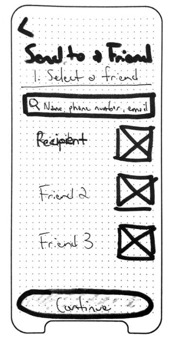
The feedback I get from my initial prototypes is that I merely made UI upgrades to the existing app, i.e. nothing new is offered. So I comb through my data again and go to the Summer Moon’s website for inspiration. There I find what the company refers to as the Summer Moon spirit: a devotion to community, high-quality coffee, and exceptional experiences. This prompts me to create a feature called Send to a Friend, which gives app users the ability to buy drinks for friends, hence building Summer Moon’s community digitally.
I choose Send to a Friend as a core item to focus on because I see it as a competitor to Starbucks’ and Dunkin Donuts’ aforementioned features, and a way to stand out while not cheapening the brand.
Week 3: Coach tells us to get up and do our 4 laps again… faster.
Designing Structures and Systems introduces a mapping technique known as Journey Mapping. If Service Slices are Calculus, Journey Mapping is Advanced Thermodynamics in a language I don’t speak. My brain just will not accept it. On top of that we are told to “find the complexity.” (Melting face emoji.)
But before that, we create and present our digitized Service Slices. Honestly, mine still lack oomph. It looks nicer, but I still feel like something is missing. I do, however, shift my focus from the customers to the employees mostly because I just have more data about them. But also because it seems like they are the common thread in all of the interactions, i.e. everything passes through them. I’m on to something. I just don’t know it yet…
For Prototyping and Testing, we present Week 2’s paper prototypes. For whatever reason, I think it will be cool to do them in Balsamiq, which ultimately does not serve me at all. Lesson learned.
We also increase the fidelity of our prototypes and hand-draw them on individual mock iPhone screens. No Balsamiq this time! My three flows include using Send to a Friend (which I put all of my eggs into at this point) to send a drink to a friend, using Send to a Friend (did I mention I put all my eggs in this basket?) to receive a drink from a friend, and navigating to another new feature I create called simply, Glossary. Glossary is a screen users can navigate to in order to learn more about Summer Moon’s products as well as coffee-related terms in general.
I put all of my eggs in the Send to a Friend basket, and Glossary to a lesser degree, because I really feel like Summer Moon needs a way to distinguish itself from all of the other coffee companies and their apps. Its app seems so basic compared to the others and I want to bring something flashy to it.
We also, also start writing our scripts for Usability Testing. Here, I assume, will be the point at which all of my egg-hoarding proves lucrative…
Week 4: Coach is yelling at us while, simultaneously, my lungs feel like they’re going to explode.
“Make a mess” is rearing its head again in Designing Structures and Systems. Only this time it’s related to Journey Maps. Lovely.
To make myself feel better, I draw digital lines on top of the picture of my physical Journey Map that I uploaded to mural. I’m thinking this will breathe life into a dying concept. It doesn’t work. Frustration is starting to set in.
On top of that, Usability Tests for Prototyping and Testing are complete, and Send to a Friend is a bust. The tests go well, it’s just that it’s not a great idea. It creates more problems than it solves because it mostly creates confusion.
Also, we present our Usability Test findings and I’m nicely told that my prototypes are sloppy. Lovely.
So naturally I double-down on Send to a Friend, and suggest that because the Summer Moon app already prompts its users to tag their favorite locations and orders, we make people’s favorite drinks public so that other users can one-click purchase drinks for their friends. Basically, I’ve suggested a social network within the Summer Moon app. (I’m cracking up as I type this.)
Again, I’m still holding onto this idea of differentiation, so I’m choosing to stand by my idea out of pride and a sense of “where to go next?”
Week 5: “Ok, my ankle is definitely swollen and I taste, what I imagine is, lactic acid.
In Designing Structures and Systems we present our Journey Maps. It goes poorly because I present a glorified workflow. I choose to make this Journey Map, knowing it’s subpar, because it’s all I have. I now realize how important gathering good data is from the beginning.
We’re now discussing our Final Presentation which is a joint assignment using materials from our Prototyping and Testing class. Oh, hell no.
Speaking of Prototyping and Testing, we’re learning Figma because we’ll soon be digitizing our prototypes. Send to a Friend has not earned the right to be immortalized, so I swallow my pride, bury Send to a Friend, and ask for help because my situation is only getting worse.
Luckily, I’m given the thumbs up to make a soft pivot. It’s about time because trying to fit a round peg into a square hole has caused me to taste lactic acid.
I do have to go back and redo the paper prototypes, but am more than happy to do so. I choose to focus on Summer Moon’s employee experience (surprise, surprise), specifically it’s POS (point of sale) system, because the employees I originally spoke with had pains while using it.
Week 6: “I am in pain. But I am in shape.”
Scenarios, Storyboards, Vignettes, and Value Promises in Designing Structures and Systems.
We’re tasked with creating 50 Vignettes, which feels like an astronomically large number at first. But then I realize I’ve been training this whole time and can do it. So I just do it. Nike would be proud.
I also go back to 2 Summer Moon locations to conduct another round of Contextual Inquiries. And guess what? My new Journey Map is messy, but doesn’t feel so Thermodynamicy.
In Prototyping and Testing, I’m playing catch up so I knock out 2 rounds of prototypes. Specifically, I focus on three flows: clocking in, voiding an order, and creating/submitting a reminder.
I choose clocking in because I’m shocked that Summer Moon employees have to accomplish this task on their POS monitor and on the ADP app on their phone. Why not just do it on the monitor? I think.
I choose voiding an order because I hear employees tell me this happens most during peak busy times when they need to quickly get in and out of the POS.
And I choose creating/submitting a reminder because today Summer Moon employees are creating reminders on post-it notes and sticking them to their fridge, or texting their shared group thread known as “The Moonies.” (Reminders are created to remind others that a customer was dissatisfied with their drink and will return at a later time to claim a new one.)
We also use our third round of prototypes, our highest fidelity ones, for Unmoderated Usability Testing in a tool called Maze. Despite having less time to work on these prototypes, they perform really well during testing. Send to a Friend is merely an afterthought at this point. RIP.
Week 7: Coach is secretly a genius, and has been pushing us hard, knowing that we were plenty capable all along.
For Designing Structures and Systems we finalize our Scenarios, Storyboards, Vignettes, and Value Promises.
We present these plus all of our artifacts from this quarter. I choose to present all of the rounds of prototypes because I feel like they tell a solid story about the work I did…
And in Prototyping and Testing we synthesize our data from the Usability Tests, and present everything we created throughout the quarter.
Week 8: Olympic-bound.
We practice our joint presentations amongst our class, make final edits, and present it again a few days later in front of the AC4D community.
I scrap most everything, artifact-wise, in favor of just showing off the final versions of the Journey Map, Prototype, and Storyboard. I think I’m starting to understand what is meant by “tell a story.” (Basically, it’s just a shift of mindset to focus on narrative over process. But it’s easier said than done.)
Overall, I wouldn’t have done this quarter any other way. It was only by choosing the wrong direction and pivoting (WHILE GETTING MY ASS KICKED) that I was able to find my way back. I’ve heard actual Olympians say, “Enjoy the process.” I think I’m starting to understand that, too.
RIP Send to a Friend.
Embrace ambiguity: Discover as you go
When we were prompted to choose a service which we enjoyed, and also has a digital component to it, I felt a bit lost to be honest, questioning where to start.
It is quite easy to point at the friction points you’ve encountered, after all, you chose -and use- the service. But as they say… “If your results can be easily predicted, then you're probably not doing anything new”
In this case, we’ll go over the Rappi experience, which is a delivery service popular in Latin America.
Start wide
Going back to where to start, if you are curious on where to start, my recommendation is to just do it. Plan out interviews with people involved, do cold-approaches on the street with people that usually interact with the service, who work for the service, stakeholders if possible.
As you start lifting this information, you’ll soon realize the problem becomes more and more evident. The more interviewing you do, the more apparent it will be.
Given Rappi is so spread out, I did callouts on social media looking for people that use Rappi at least once a week, then set 15 min interviews to get a grasp of their experience with the service and app.
“Drivers arrive angry, with bad attitude. Even if you tip”
Mapping raw data
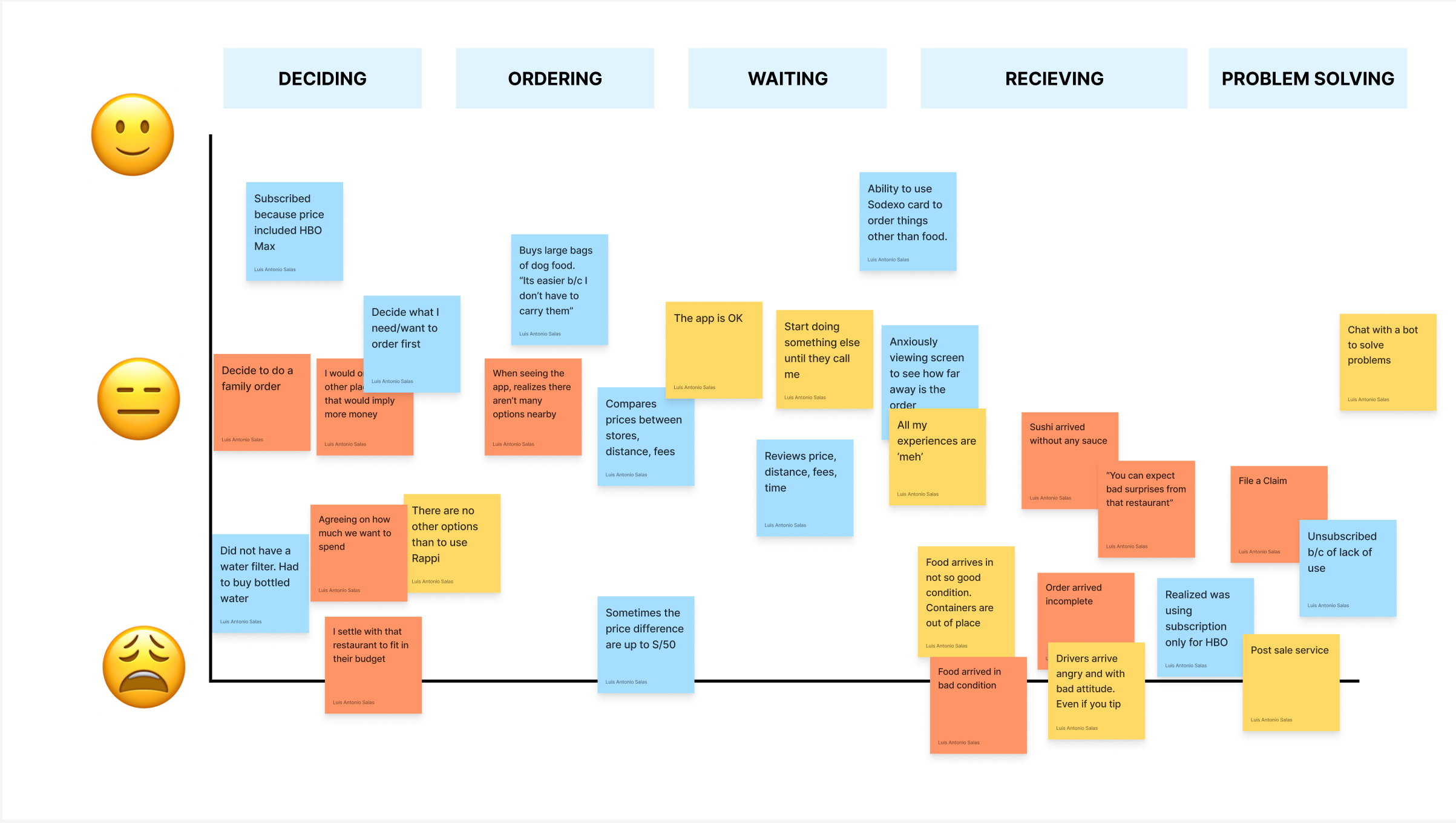
Once you have enough information gathered, there are various artifacts you can choose to use, in this case we did a Customer Journey Map, this artifact is great to layout over a timeline different feelings and touch points users encounter when using a certain service.
This will help you to have a visual, birds eye view of what the experience looks like, so similar to a heat map, it is very easy to find patterns on where is the service failing, making users feel frustrated and where is working well.
Filling out the gaps
In this part is where you the hard choices start to arise, decide if you want to focus on the more complex part of it, what ripple effects would that have? Is it better to start with the low hanging fruit and then move on to the bigger part of it? All this questioning will arise as you start ideating, and that is completely fine, it is part of it.
With your journey map you should be able to find 3 key things: Insights, observations and breakdowns, which is where the service is breaking down, failing and ultimately becoming a pain for users.
Insights and Observations:
Users felt they were tricked into paying more if they did not investigate enough about prices among stores.
Bad reputation is already settled in
There is a sentiment of bad service from the drivers
Subscription model gives a faux sense of saving, when in reality prices en up being the same if not, higher.
Breakdowns:
Ending up paying more
Not seeing the value on subscription
Having to review prices everytime an order is placed
Food arriving in bad condition
Bad attitude from drivers
Value Promise
How do the findings until now can be condensed into a sentence? This is where value promise comes into play.
Based on the information you gathered when doing your initial research, it is a good practice to map out those users, who are they? What are their goals with the service?
This will help with later stages of ideating but more importantly, build a constraint around your ideation, so you can me mindful of how the solution you will propose helps this audience achieve said goal.
“Ordering food from Rappi should be an equitable, engaging and transparent experience for all parties involved (restaurant, driver, platform)”
Drawing, drawing, drawing
A good way to tackle this task is to create some vignettes, which are lo-fi draws of your ideas, do lots of them, always keep in mind that all ideas are valid, focus on ideating now, we’ll worry about prioritizing later.
This might sound a bit contradictory with my previous point, but letting your mind fly and play with ideas helps get the creative juices flow and with that, a crazy idea can be broken down into a more achievable one, while helping users achieve their goals.
Prioritizing
Once you have your vignettes all set, I encourage to prioritize your ideas, with a basic 2x2, in which your anchors are your value promise and on the other hand, whats extremely opposite to it, that way you can measure impact of your vignettes.
Storyboarding
The storyboard helps to tell a story, it should aim to set the context in which your solution will be used and how it will impact your users life.
Here we can see how the solution proposed fits into Charlie’s life.
More drawing… and testing
Once you have prioritized the features you would like to work on, it’s time to start prototyping. If the solution you’ll be focusing has a large digital component, as it is the case here, first comes paper prototyping, the reason being, we need to make sure it makes sense usability wise, and with black and white prototyping we achieve just that.
As we heard on the Prototyping class, participants will provide feedback based on the fidelity you’re showing them, so ensure to validate your ideas with pen and paper, at least for the first iterations.
To conduct paper prototype testing, its better to cold approach people at where they are most likely to use the service. Since Rappi is mostly used at home, I went to coffee shops to cold-approach people and ask them if they would like to participate.
You’ll get a lot of No! and that’s OK, the more you hear it, the less you think about it, whats important here is to validate your designs and hear what people have to say.
Now on to the fun stuff!
This is the stage which I personally enjoyed the most. Translating this designs into hi-fi prototypes. I chose 3 main flows to focus on:
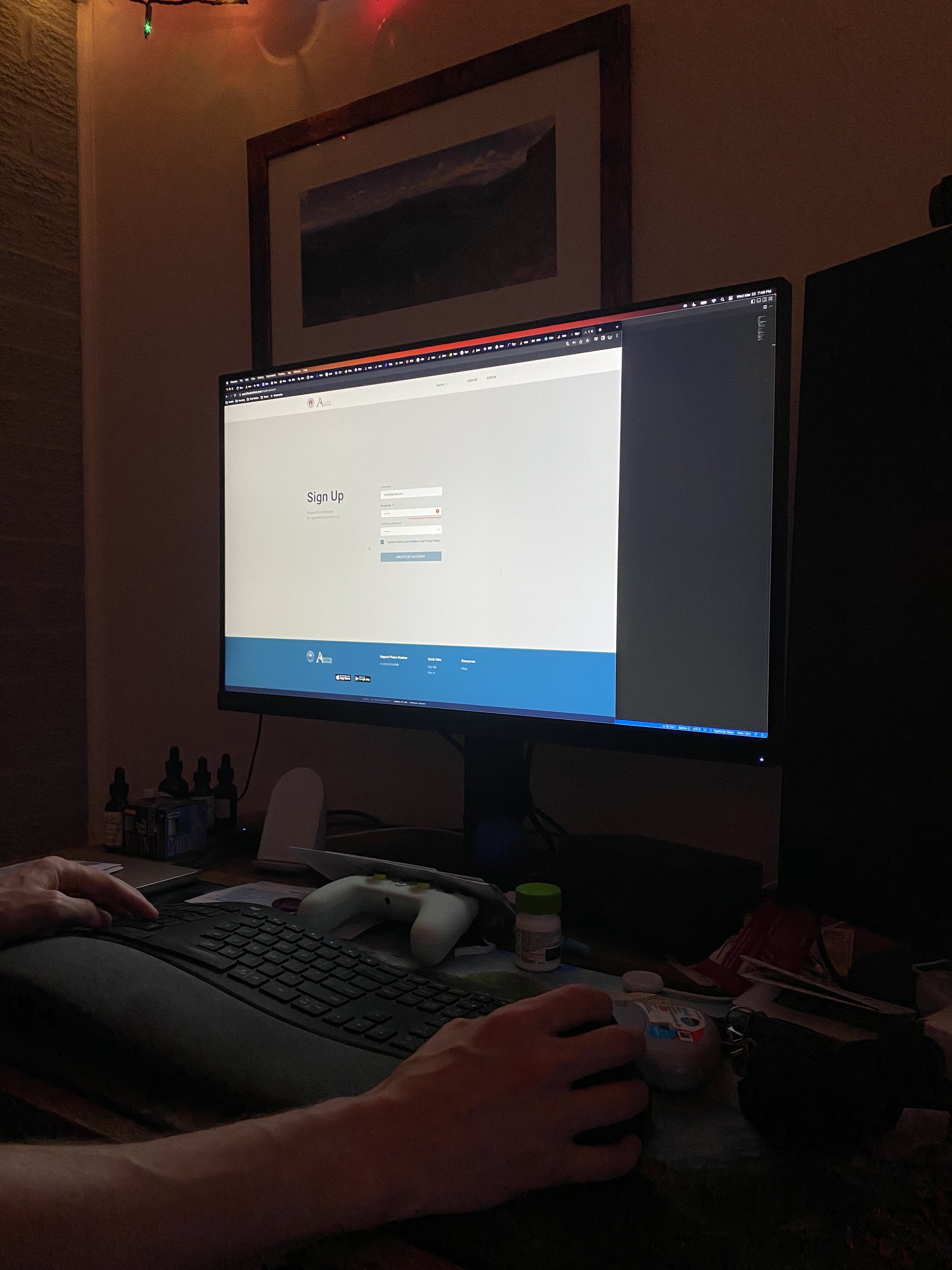
Account creation
Ordering food and learning more about fees
Repeating your last order
Redesigned Rappi shopping experience, with focus on transparency.
Testing, again
Once you feel comfortable with your hi-fi prototypes, we then start connecting those and build an interactive one, in this case using Figma (which is great to do this by the way).
This will allow your prototype to be interactive as if it were a finished product (acknowledging differences).
Birds eye view of this prototype, the mess is not to fear!
Next comes setting up Maze (maze.co) which is an unmoderated testing platform, in which you can set tasks for your users and link your prototype. I would encourage you to use abstract enough prompts so its not that obvious for participants how to achieve the goal.
Do:
“Let’s say you decide to order a burger combo using Rappi, how would you do it?”
Don’t:
“Clicking on restaurants, order the first burger that is being shown, without adding any extras.”
As you see, prompts should not be leading, remember what we aim to accomplish is to validate the usability with little context, that would provide the most true to life results, because its the way we ultimately interact with products at the end of the day, we explore, we don’t have someone guiding us all the time when using a new app.
Takeaways
We have covered all steps, starting from an abstract research focus, and ending with concrete solutions that are actually useful for users.
Using this process is great to discover friction points you might not be aware of, this helps going beyond what an NPS number, a survey or a comment on the App Store can provide. This is why it is very important to do this tasks, this way we can ensure our product keeps users at the center of it.
Redesigning the Barton Springs Mobile App
The following post explains the process of redesigning ATXswims, the mobile application for purchasing tickets for going to Barton Springs.
For this project, I was prompted to choose a service that involved a digital touchpoint and evaluate it to identify pain points that people experience, with the goal of creating solutions to address these pain points. This project spanned a total of 8 weeks.
I chose to explore Barton Springs, a well-loved destination in Austin with multiple digital touch points. As someone who has visited Barton Springs many times, I thought it would be interesting to explore the ticket-buying experience for visitors, which can be frustrating, especially on busy days.
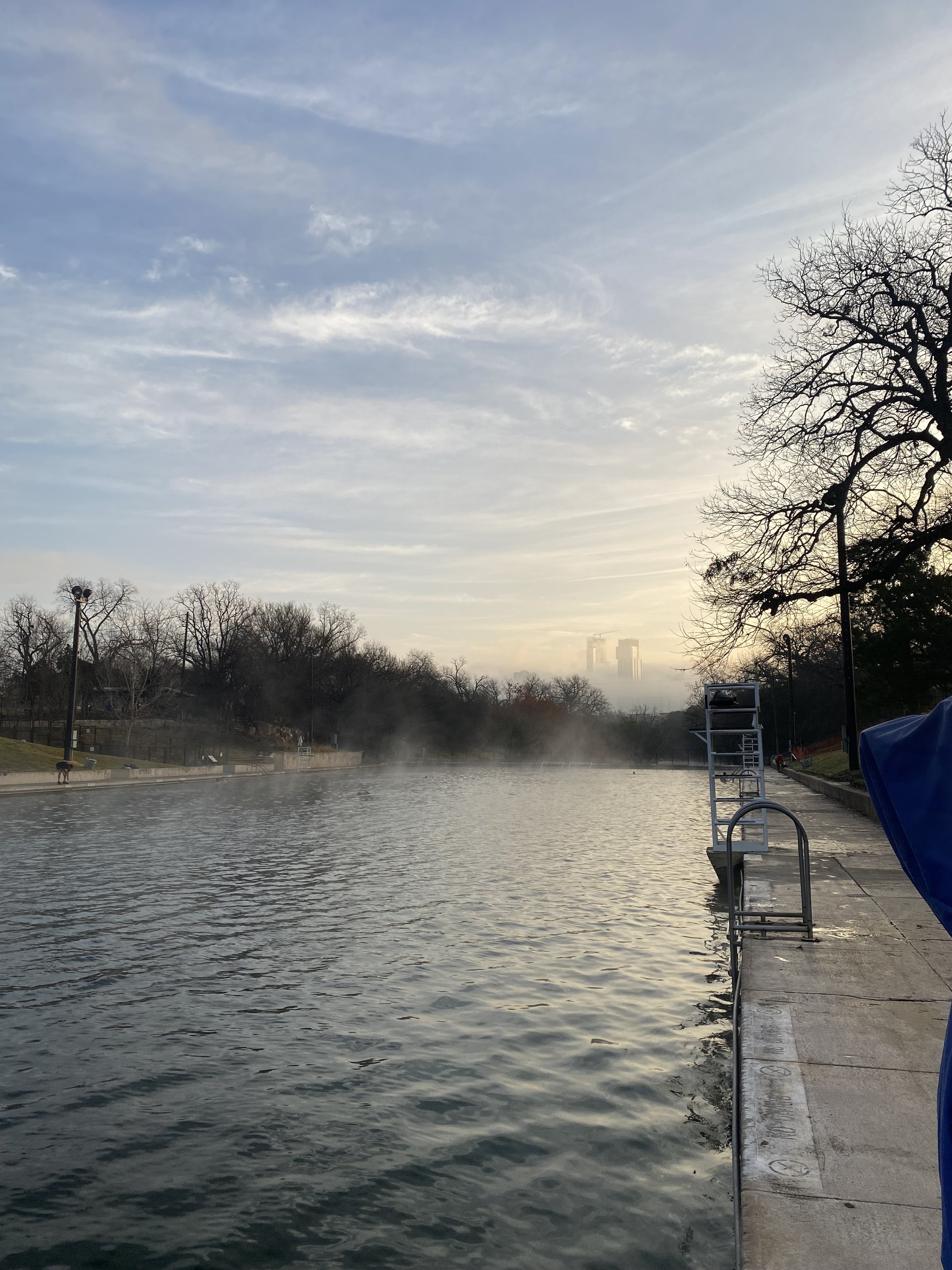
Barton Springs Pool in Austin, TX
Our Process
Background
When people visit Barton Springs they will purchase a day pass in one of 3 ways. Using the kiosk, mobile app or webpage.
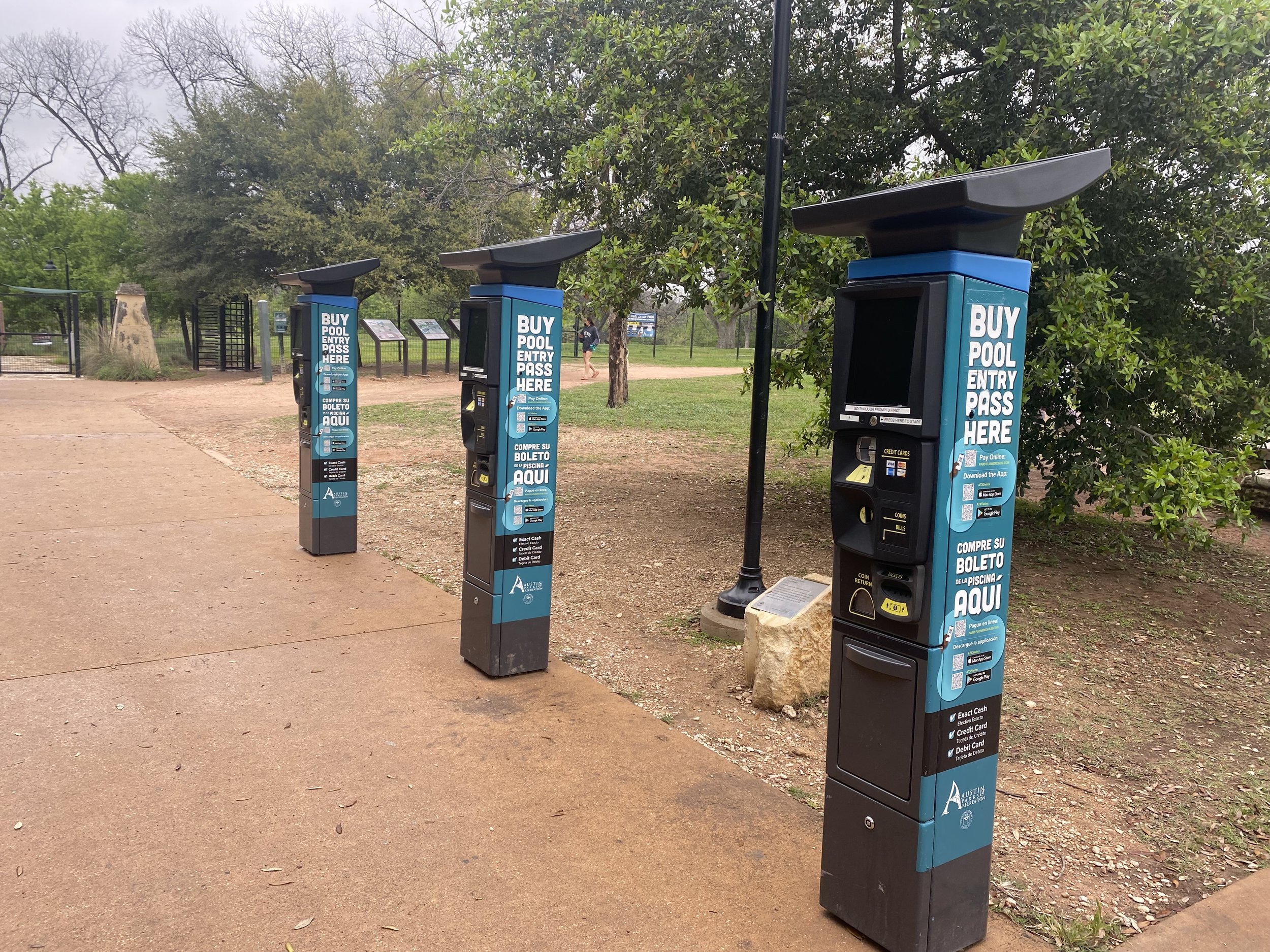
The ticket buying kiosks (which is a redesigned parking meter) often break down during hours and will take credit card or exact cash.
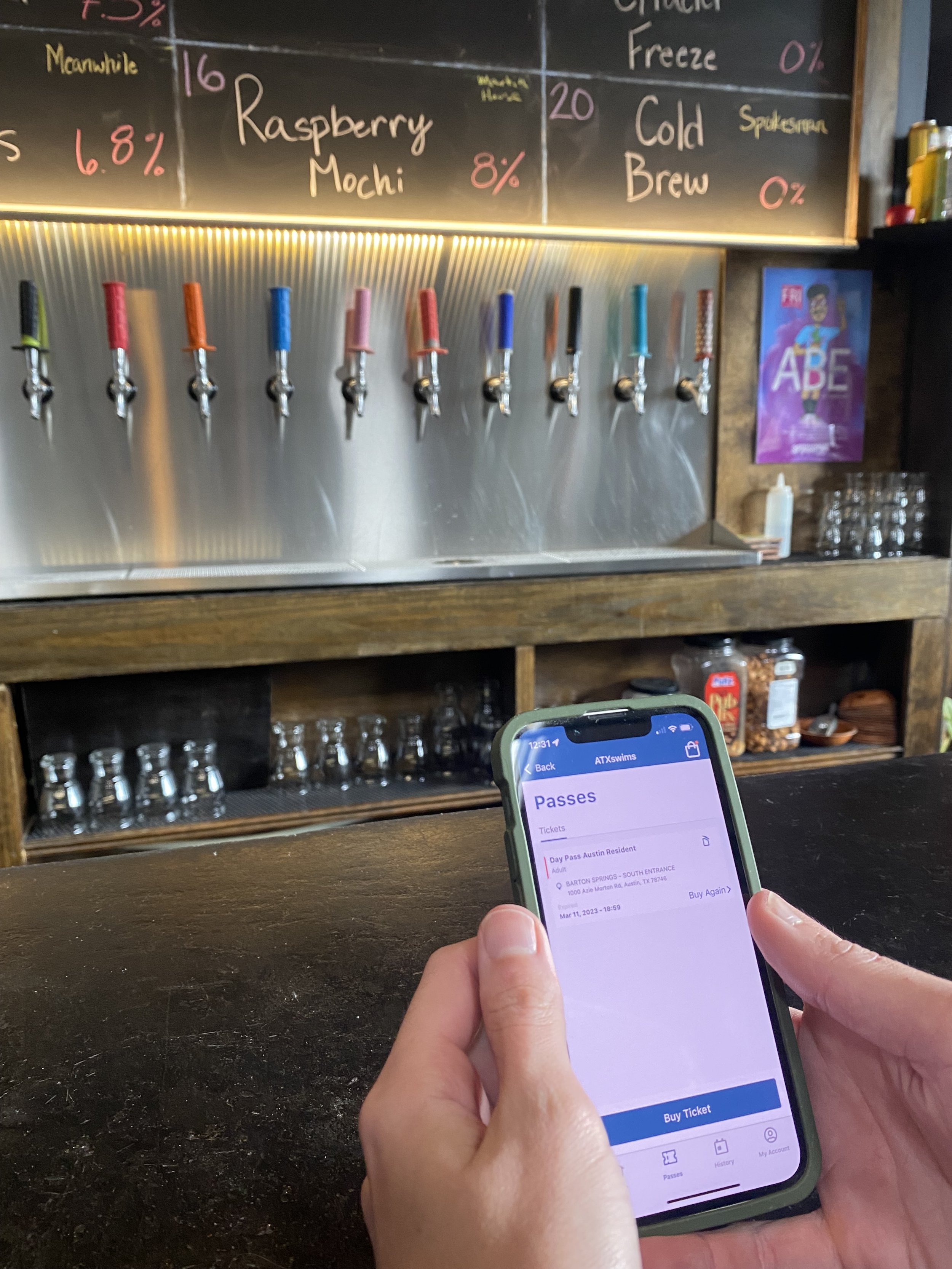
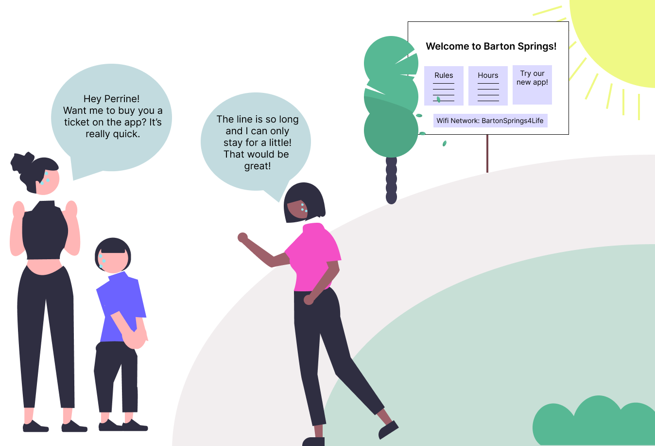
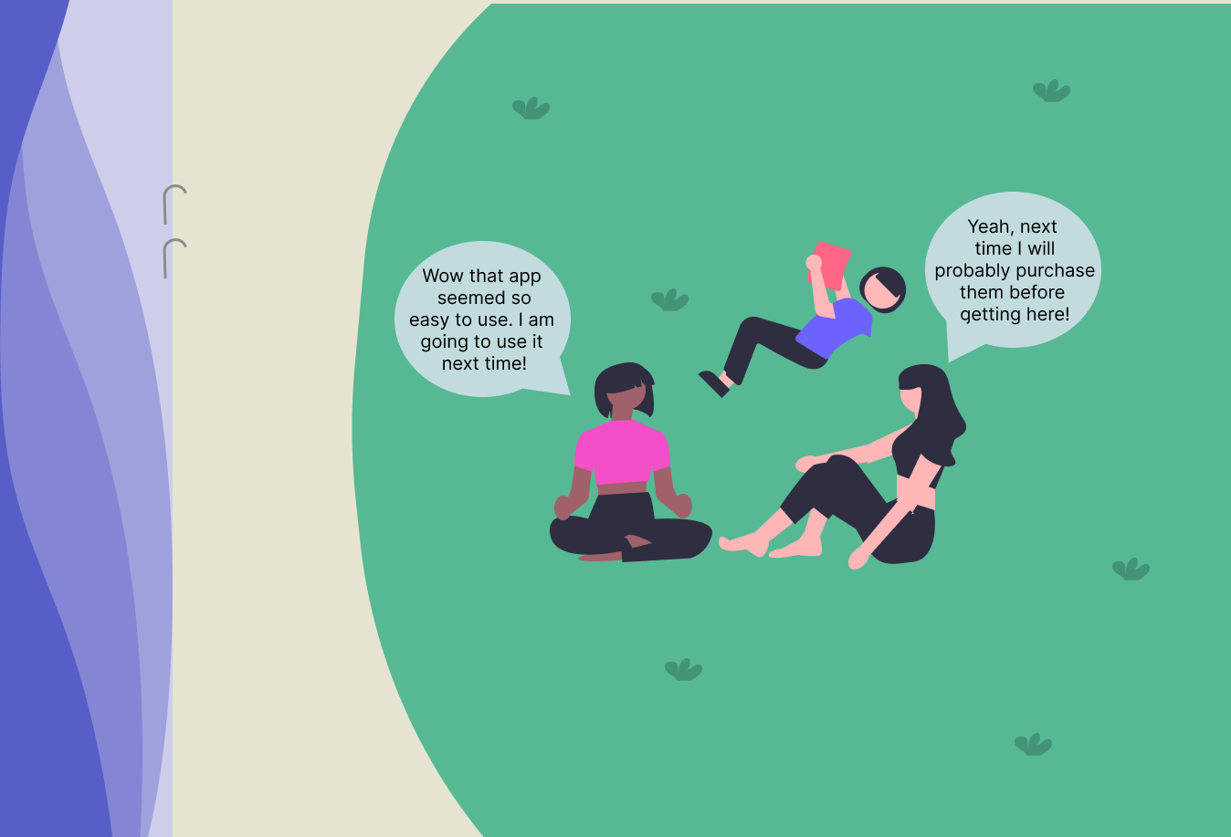
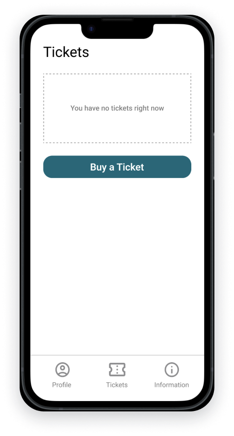
The mobile app was released in 2021 and people still tend to prefer the kiosks, due to the app being tedious and frustrating to use, with many steps and no guest checkout.
The webpage functions similarly to the mobile app, but can only be accessed from a desktop.
Research
I began by creating a research plan to focus my efforts.
Focus Statement: Barton Springs is a well loved establishment for locals and tourists alike, however, people have issues using the payment system which prevents people from enjoying their experience. What problems are people facing when trying to go to Barton Springs?
Objectives:
What issues are people facing when wanting to go to Barton Springs?
How do people experience the payment systems?
Do people feel informed about the experience that they will be having?
Interviews
To learn more about the issue, I interviewed the manager of Barton Springs and six locals from Austin about their experiences when visiting the pool. I wanted to hear about any issues they faced while visiting or working at Barton Springs, especially related to the payment system.
During the interviews, people shared how much the pool meant to them…
“I love working here. This is one of my favorite places in Austin.... If it wasn't for this pool, I wouldn't be in Austin.”
-Barton Springs Manager
“It’s like nothing else.. I can't even describe how good it is to people who haven't been to Austin... It's the entire environment... where people come together and you can see the city. It's just lovely.”
-Adam, an Austin local of 10 years
They also shared about their frustrations with the payment system at Barton Springs…
“I tried to go to Barton Springs last weekend, but there was a massive line for the Kiosk and the app was taking so long to use. I ended up just going home”
-Larry, Austin Local of 2 years
“In the amount of time it takes to create an account, I probably would have just put this down and tried to get the kiosks to work again.”
-Justin, Austin local of 5 years
“I occasionally purchase tickets for Barton for friends that don't have the app set up... the initial ticket buying process is tedious so I end up buying passes for friends because I already use it.”
-Nancy, Season ticket holder for Barton Springs
“I've actually applied for a new job as of two days ago, because as we're coming into the busy season, part of me, doesn't want to deal with [payment related issues] for another season.”
-Barton Springs Manager
During the research process, I discovered why people prefer using the kiosks over the mobile application. People dislike having to create an account and the mobile app does not offer a guest option. Although people generally tried the mobile experience, they abandoned it because it took too long to use. Additionally, the payment process at Barton Springs poses significant challenges for the staff, especially during busier periods.
Synthesis
Service Slices
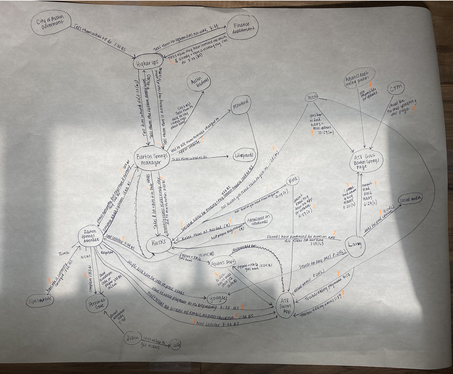
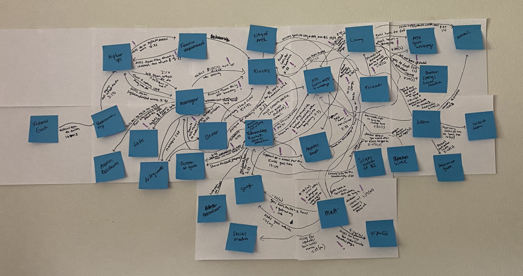
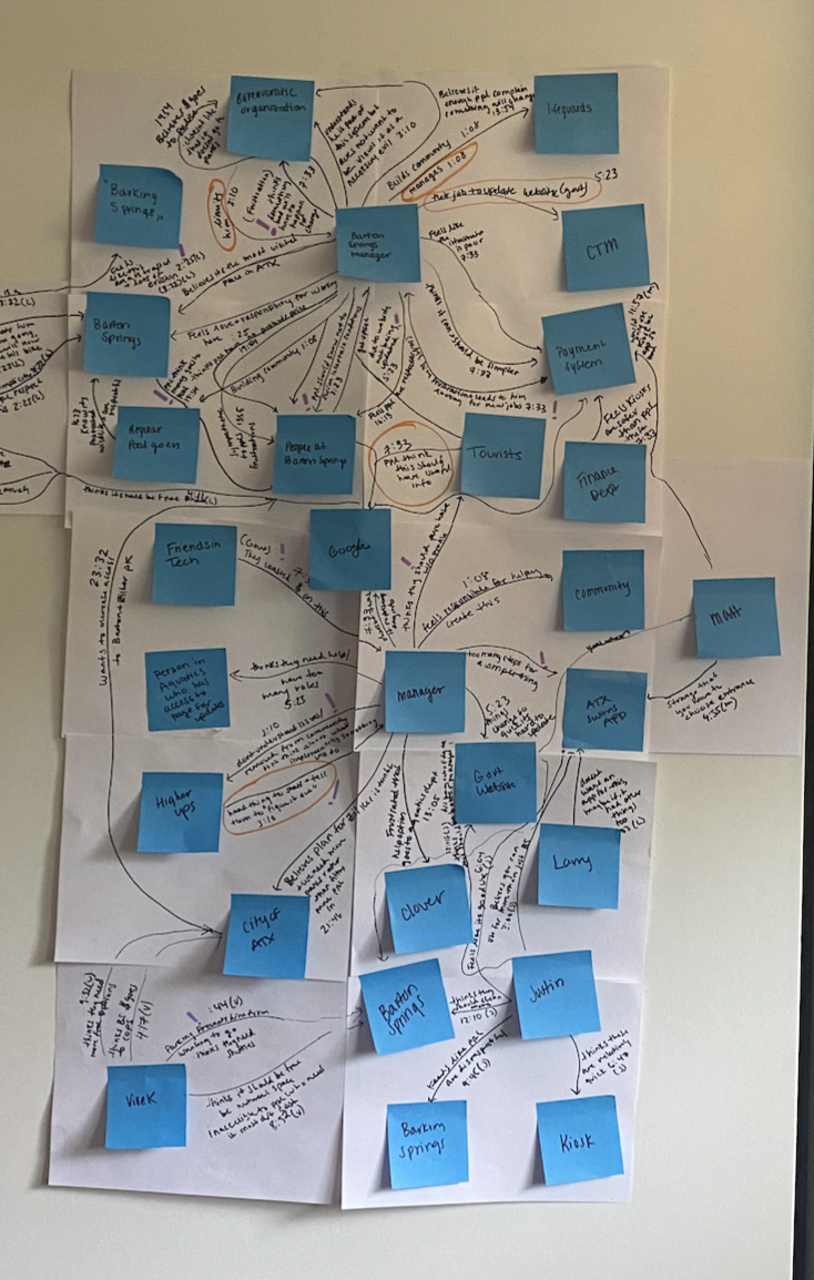
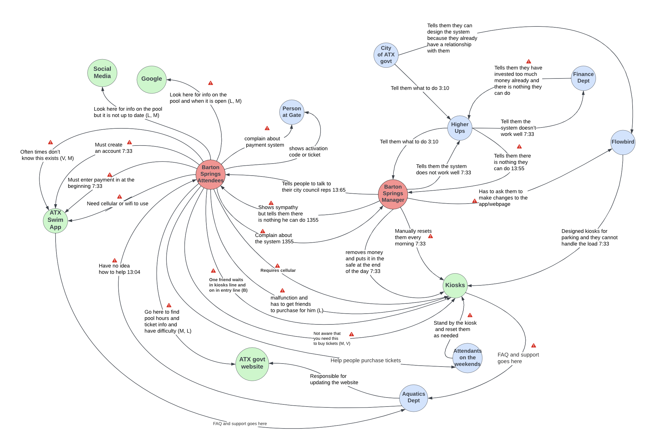
After conducting interviews, I examined the system as a whole by creating service slices. Service slices provide a way to analyze interactions (between people, policies, technology, objects, etc.) within the system to identify where breakdowns are occurring.
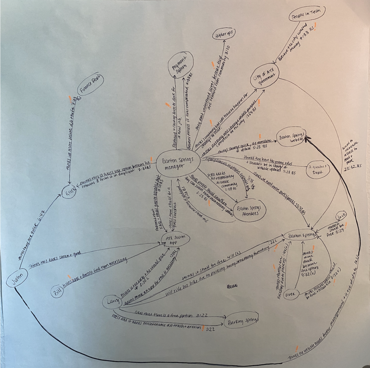
I created one service slice to show the behaviors and information exchange within Barton Springs, and another to show people's emotions and feelings during the process.
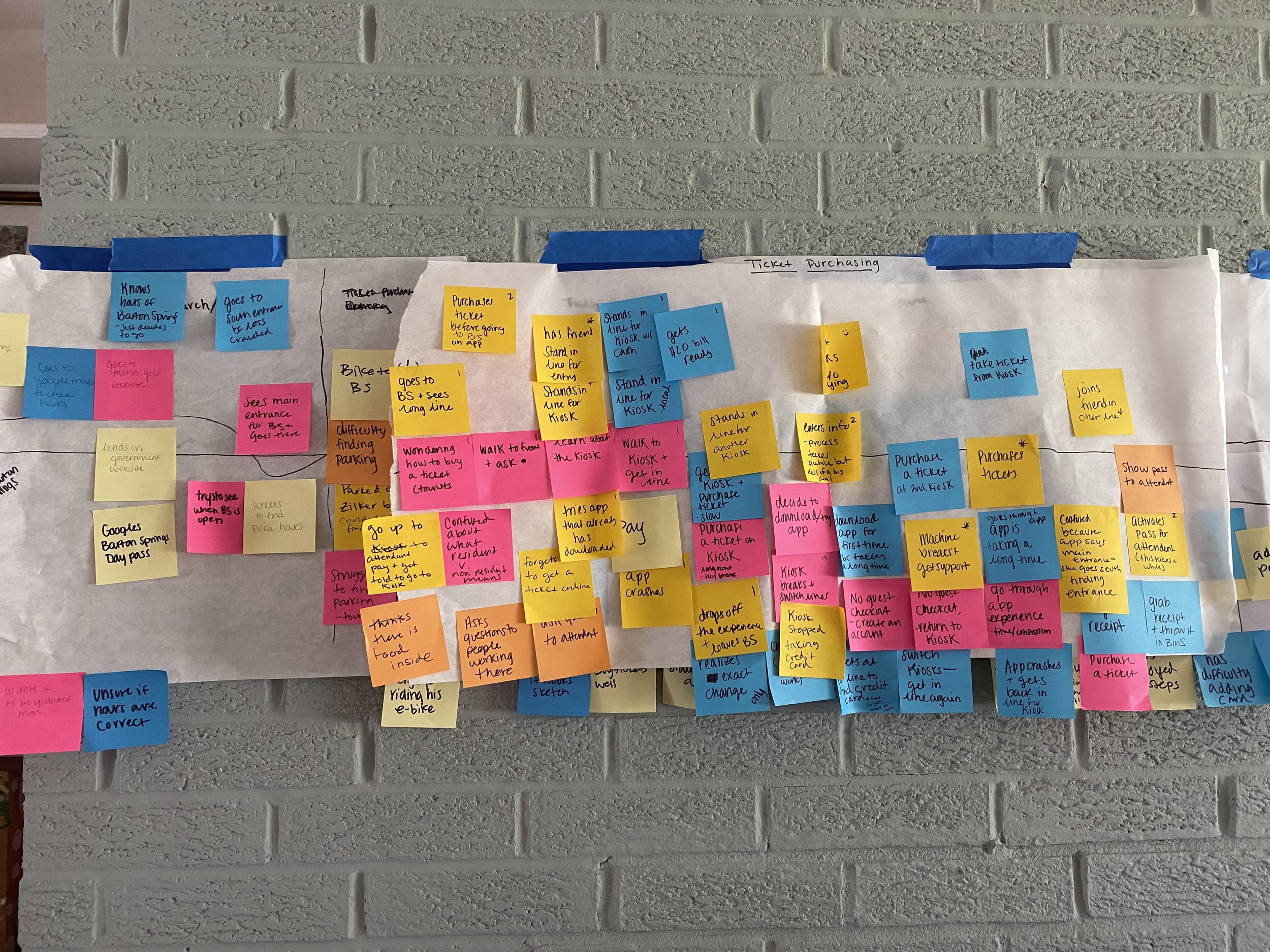
Progress Photos for Service SlicesBehavior and Information Exchange
Power, Policy, Information Exchange and Emotion
This process clearly demonstrated how much the payment system affects the job satisfaction of people working at Barton Springs. It also helped me understand why the problem persists despite there being clear issues. Although managers would tell those in charge that the current system isn't working, people in power were resistant to making changes because of longstanding contracts and relationships. As a result, the people working at the pool were the ones suffering.
After analyzing the service slices, I wanted to gain a deeper understanding of users' experiences when purchasing a day pass for Barton Springs. This informed by decision to create a journey map to uncover the nuances and identify opportunities as we move towards ideation.
Journey Map
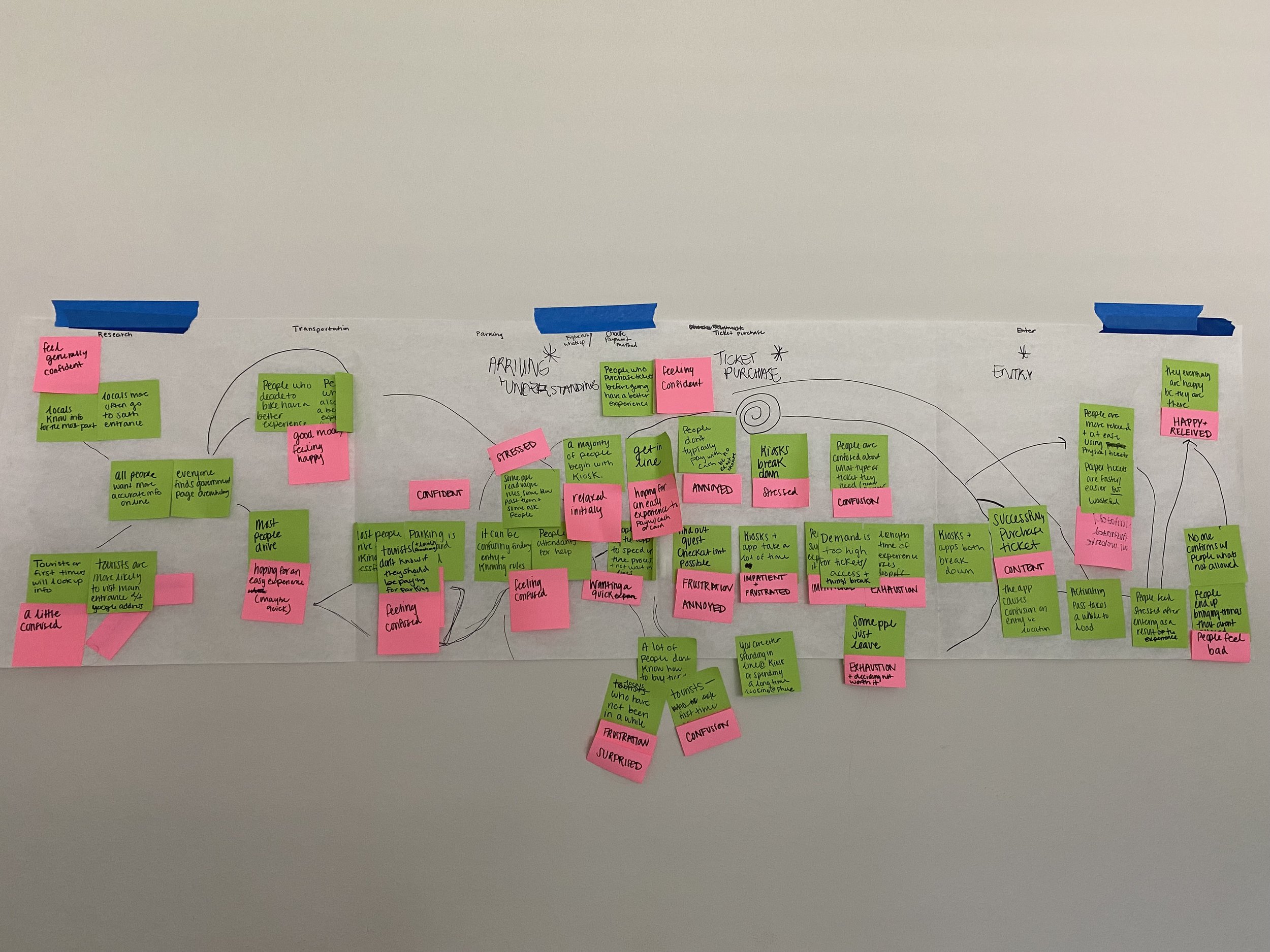
Journey mapping helped me further understand and visualize the steps and emotions users going through the process of purchasing a ticket. The experience was broken down into individual touch points, the users actions were mapped out and their thoughts, feelings and emotions were identified at each stage. The resulting map helped me identify pain points and areas of opportunity for design changes within the process.
Progress Photos for Journey MapsFinal Journey Map
Our Opportunity Area: The mobile application
The journey map helped me identify the mobile application as a place with design opportunities to improve the service, with the goal of redesigning it for clearer user flow and fewer steps to purchase a ticket. I decided to target locals, as they are more likely to use the app multiple times, whereas tourists are more likely to use the kiosks only once.
The Problem
Buying a ticket for Barton Springs through the mobile app is a frustrating and tedious process, with no shortcuts available. As a result, many people feel defeated and end up abandoning the process.
Ideation
Value Proposition
To ensure that the final design aligns with the problem identified and people's needs, I created a value proposition:
We are committed to providing a hassle-free visit to Barton Springs. To achieve this, we strive to create a streamlined and seamless ticket-buying process, allowing visitors to focus on what matters most: enjoying this beautiful natural wonder.
Vignettes
I then created 50 vignettes to illustrate an idea that would support the problem that I was trying to solve. In this stage, I was trying to get as many ideas as possible down on paper.
Next, I ranked this vignettes on a grid (easy to use vs. difficult to use, great experience vs. frustrating experience) to see which ones aligned most with our value promise.
Storyboard & Scenarios
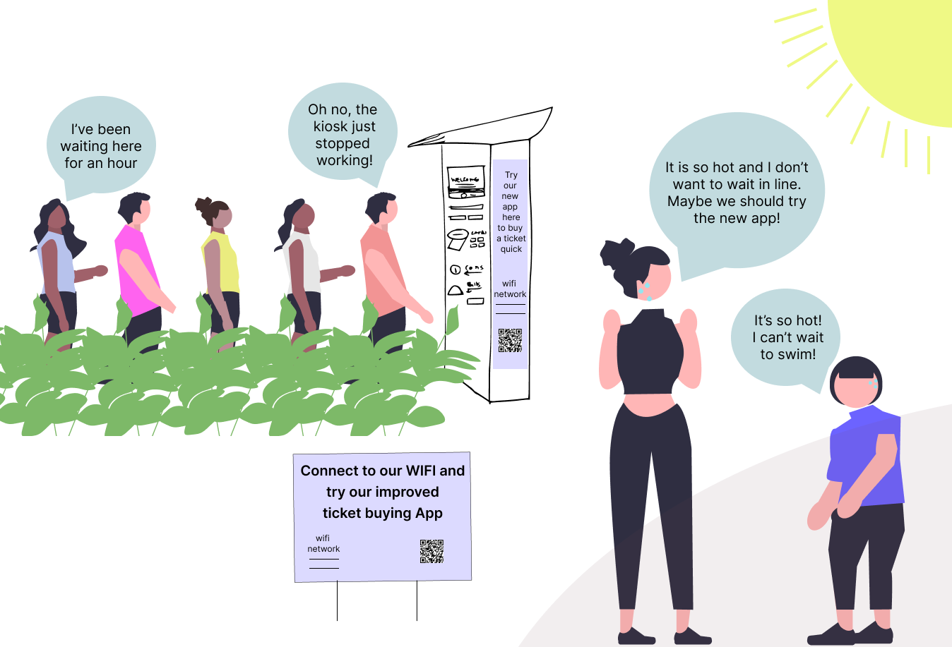
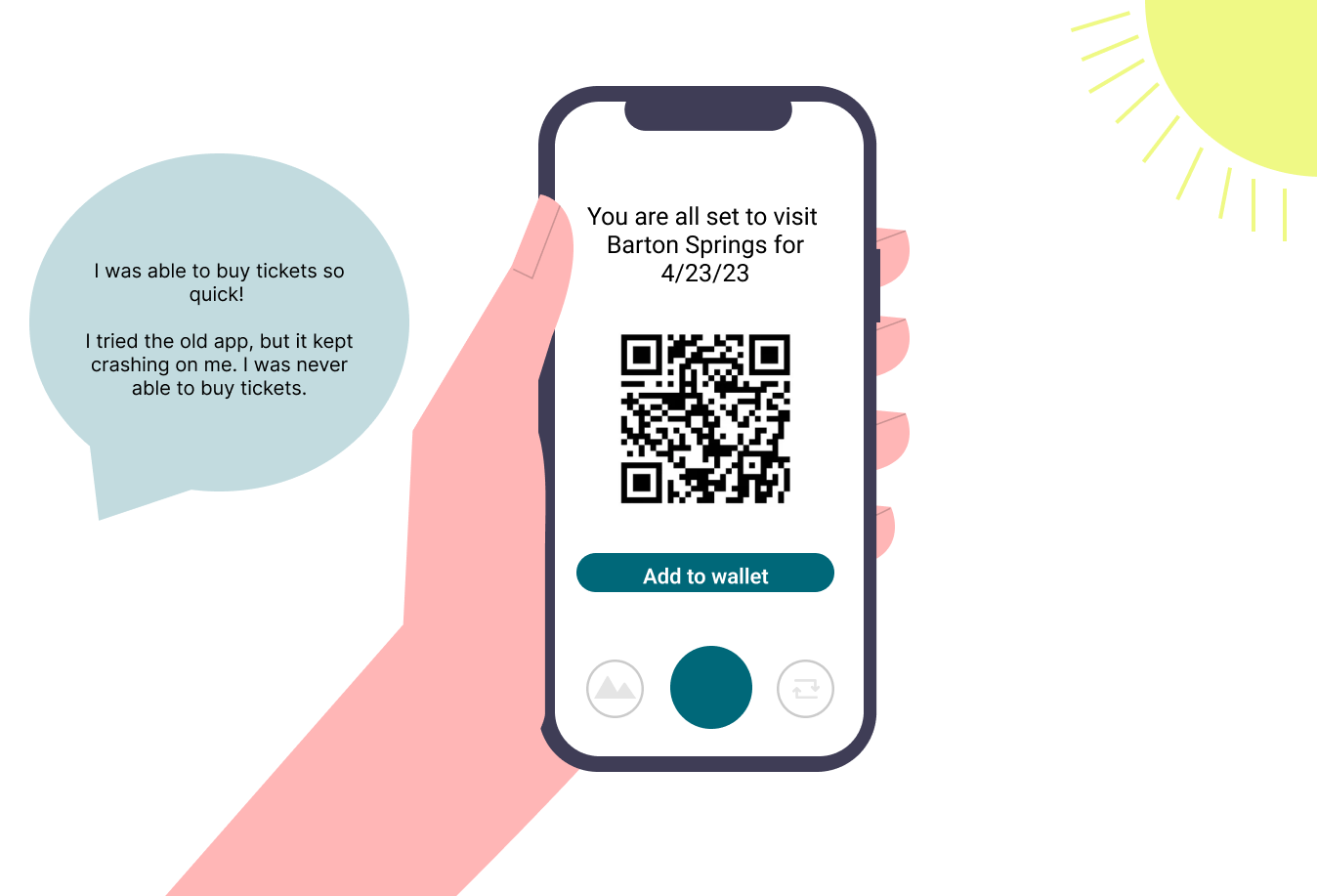
I then chose 5 vignettes to create a storyboard to envision an ideal future state with our proposed solutions. I began by drawing storyboards on paper a few times, before digitizing them.
Simultaneously, I wrote scenarios to go along with our storyboards. These gave the listener context, identified the problem and the idea, and described the use and outcome.
Storyboard: First Iteration
Digitized Storyboard
Prototyping, Testing & Iteration
Competitive/Comparative Analysis
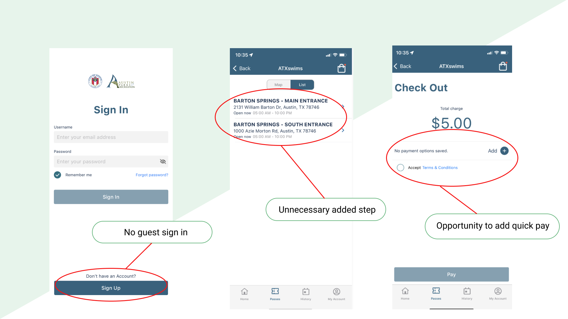
Before prototyping, I analyzed the current application to understand what was missing and where I saw opportunities for improvements. Some of our major findings were:
There was no guest login
The payment process only allowed credit card
The process was repetitive and included unnecessary steps
Ex: They make you choose what entrance you want to buy a ticket at when in reality that doesn’t matter
Current ATXswims mobile app
I then looked at other mobile applications for inspiration, focusing on public transit applications, but also looked at Amazons “buy now” feature, as inspiration for offering a quick buy option for the revised ticket buying app.
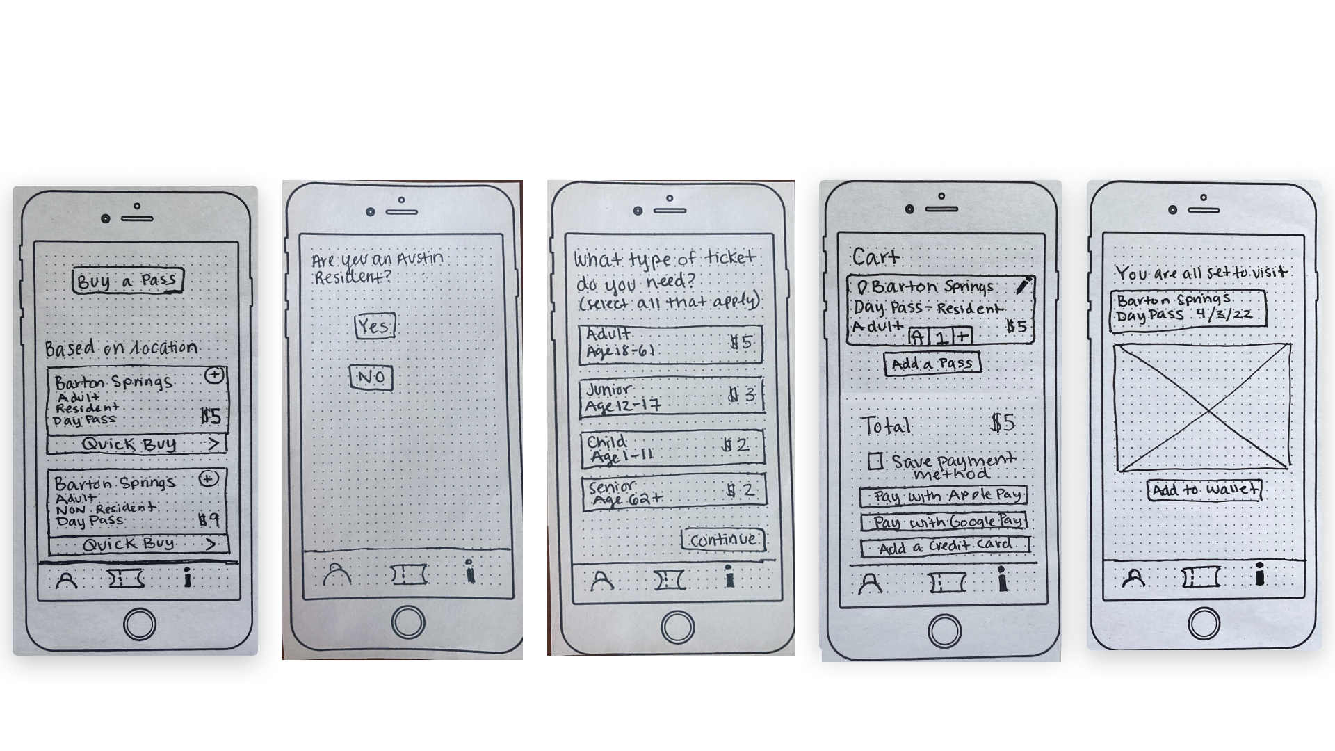
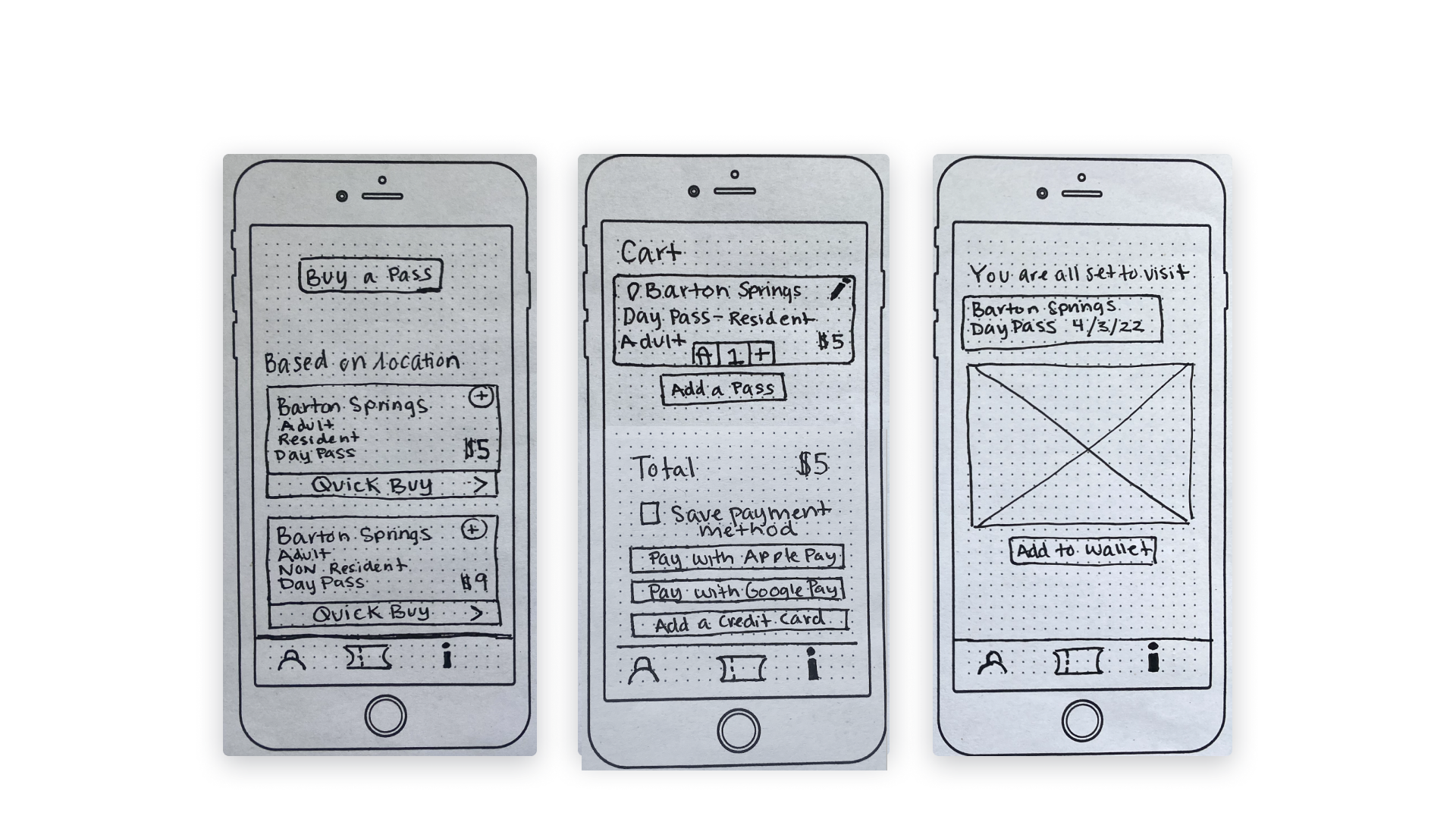
Low-Fidelity Paper Prototypes
The first prototypes was a low-fidelity paper prototype that I intended to use for a moderated usability study.
Moderated Usability Study
I tested the low-fidelity prototype with 6 Austin locals who have visited Barton Springs pool. The tester was prompted to purchase a ticket given the choice of two different purchasing flows (a more detailed purchasing flow and a quick buy purchasing flow). Each test took approximately 15-20 minutes.
This is a little bit of what we heard from our testers:
“I would probably opt for the quick flow. But if I was with my family or with somebody else, I would probably select [the longer flow].”
-Chris, Austin local of 1 year
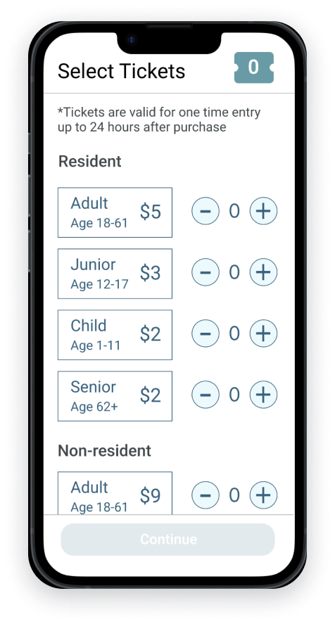
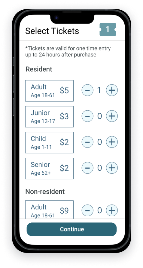
“I would want to be able to choose different types of tickets and the quantity of tickets that I want on one page, so i can do it all at once.”
-Sarah, Austin local of 10 years
Our overall findings from the usability study were:
The “buy a pass” button was often missed and the function was unclear.
The ‘based on location’ title didn’t convey the intent clearly.
People felt displaying “Barton Springs” on the ticket was unnecessary, when the differentiating factor was the ticket type.
People want easier ways to purchase different types of tickets.
The "add a pass" button on the checkout screen was interpreted in different ways
High-Fidelity Prototype
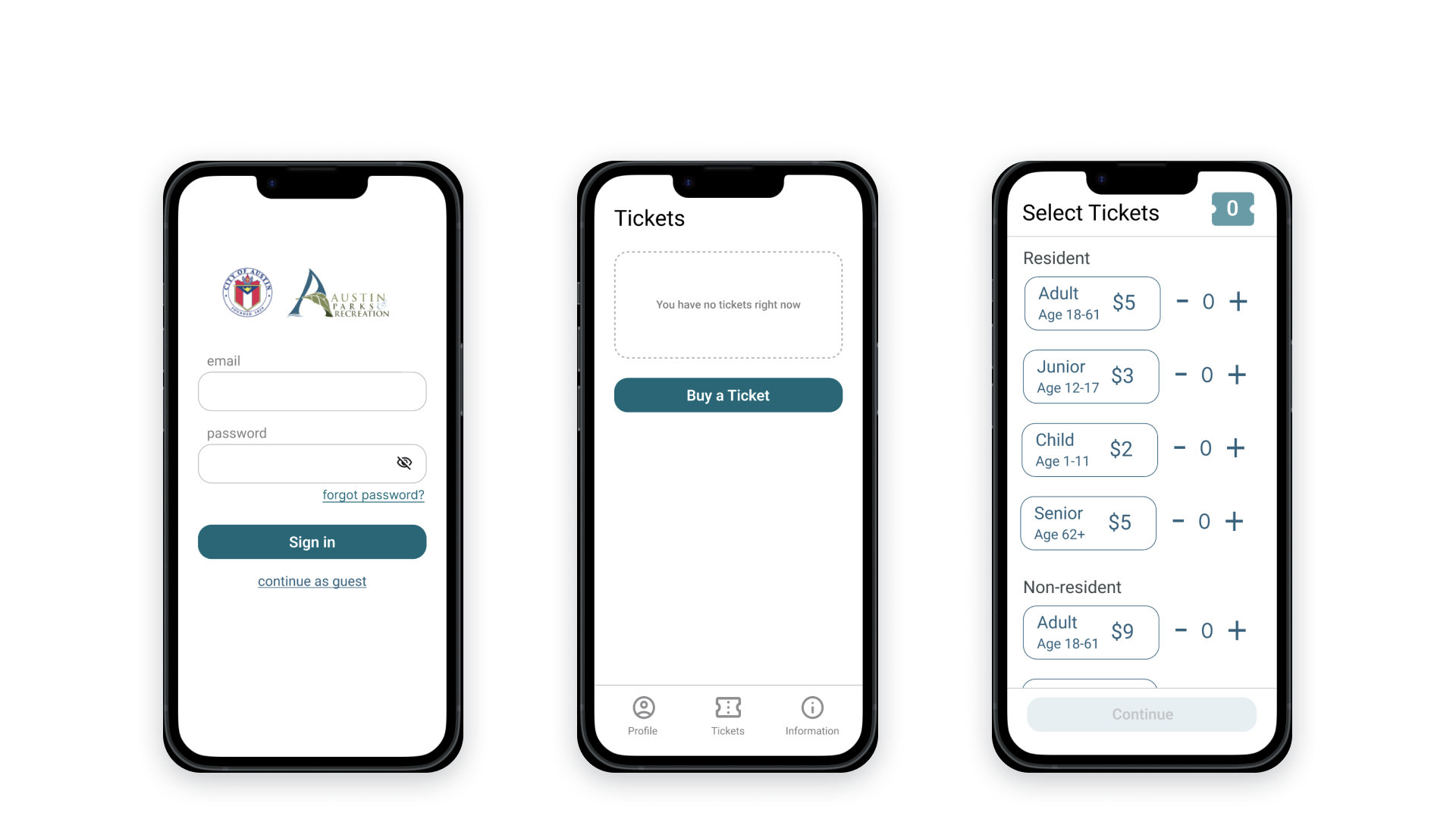
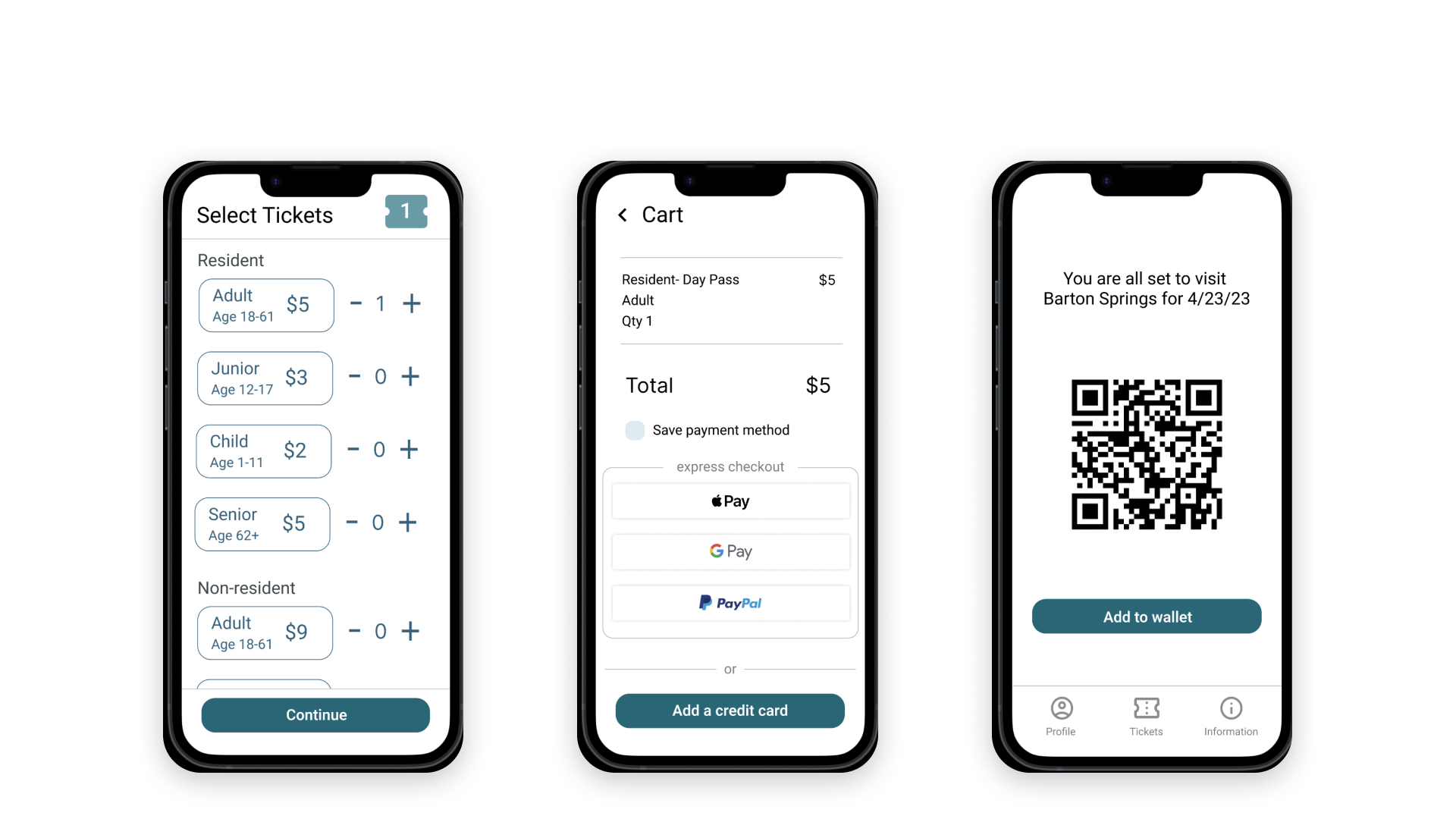
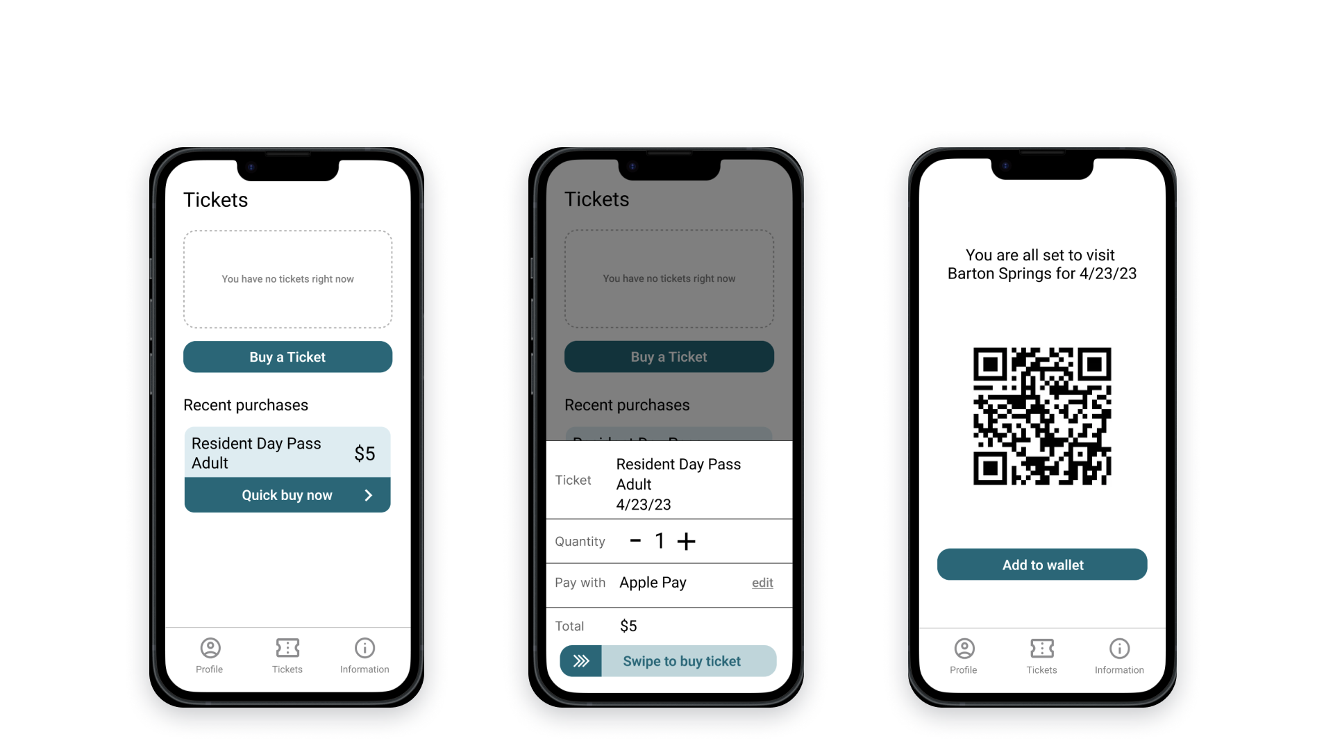
With the insights from the moderated usability study, I iterated and digitized the prototype.
Unmoderated Usability Study
I tested our high-fidelity prototype with 27 people (Austin locals and tourists) with an unmoderated usability study on Maze. The tester was given two tasks, purchasing a ticket with the “standard purchasing flow” as well as the “quick buy flow”.
The overall findings from this usability study were:
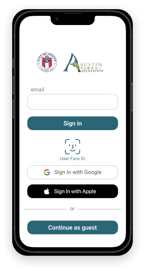
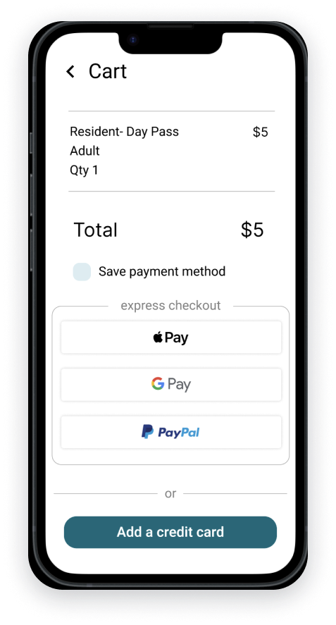
The guest checkout option should be more prominent.
Users want more sign in options (faceID, google, apple, fingerprint).
Too many features looked like buttons.
People want more information about the ticket.
People wanted the quick buy page to be simpler.
People liked the design overall.
Revised Prototype
The most recent version of the prototype was iterated on with the feedback from the unmoderated usability study.
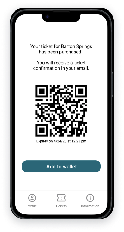
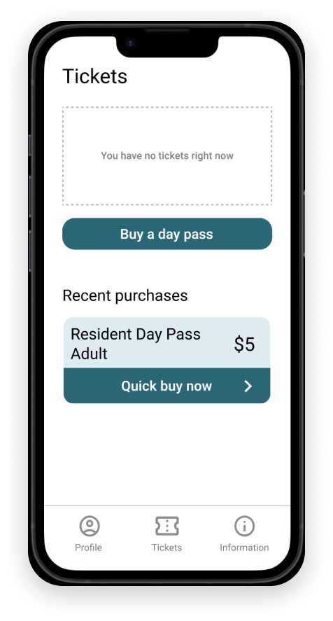
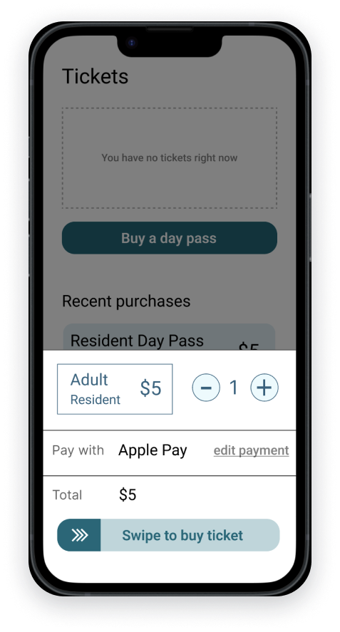
Purchasing FlowQuick Buy FlowConclusion
Next Steps
If we were moving forward with this design, my next steps would be:
Discuss the design with the engineering team to ensure achievability.
Continue user testing and iterate on the design as necessary.
Develop incentives and strategies to promote usage of the mobile application over the kiosk.
Explore additional feature requests, such as purchasing a season pass.
Reflections
Throughout this project, I have learned valuable lessons that I intend to apply to my design process in the future:
Make sure to perform research and observation during the times where you will see the most problems exposed. I wish I had realized earlier to do my research at the busiest times at Barton Springs.
Only include in designs what you are wanting feedback on, the level of fidelity will match the feedback that you are getting back. This goes for the presentation of findings to stakeholders as well as testing the prototypes with users.
Your assumptions of what people will want can sometimes be very off, user testing and feedback on the design will ensure that we don’t create something that people don’t find helpful.
And then for simple design choices, ensure non-buttons don’t look clickable.
I hope this insight into the redesign process has been informative and enjoyable. I thoroughly enjoyed working on this project and would love to work on more projects that improve people's access to and enjoyment of public outdoor spaces.
Austin Public Library- App Proposal
This presentation began as an examination of a service with both digital and physical components. Over the following eight weeks, I would begin researching pain points of other patrons, synthesizing their thoughts and feelings, create solutions for these problems, prototyping a product to address these problems, and testing this product with users. I identified the Austin Public Library, due to it’s use of over 1 million residents, and it’s personal importance to myself.
The Research
The library’s service of loaning books encompasses three main components. The physical space where people check out books and spend time, the digital space where people browse the digital/physical inventory and place holds, and the community space the library offers.
Willie Mae Branch
I chose the Willie Mae Branch and began to interview patrons for a few reasons: it isn’t the main branch and has not received updates in years, it serves a historically low socioeconomic status neighborhood, and it’s my own personal library. I asked patrons questions regarding what they appreciate about their library, what their preferred uses of their library were, and what they would like to be improved about their experiences. I spoke to eight library users and one librarian for a cumulative two hours within the library. I heard the following from the people I interviewed.
“I feel like a library can be a great place for community for socialization for older adults for maybe classes, lectures, information, but they don't do that. And I wish they did.”
-Ron
“The library is not that clean, and there's often this smell...I would stay in there longer probably if it was nicer”
-Haley
“It's old. It's dingy, and it's not welcoming...it’s got old carpet, old shelves, cramped space, it’s an old building”
-Jenny
From these quotes and others, two clear themes emerged. There is a disconnect between the digital resources and the physical library caused by the sprawl of information over multiple platforms combined with confusing navigation, making digital resources inefficient. People believe using the library as a community space is important, but they’re not using it because it is in disrepair. People felt frustrated that the community services their library could offer, just didn’t seem to be there, and this perpetuated isolating people from their library community.
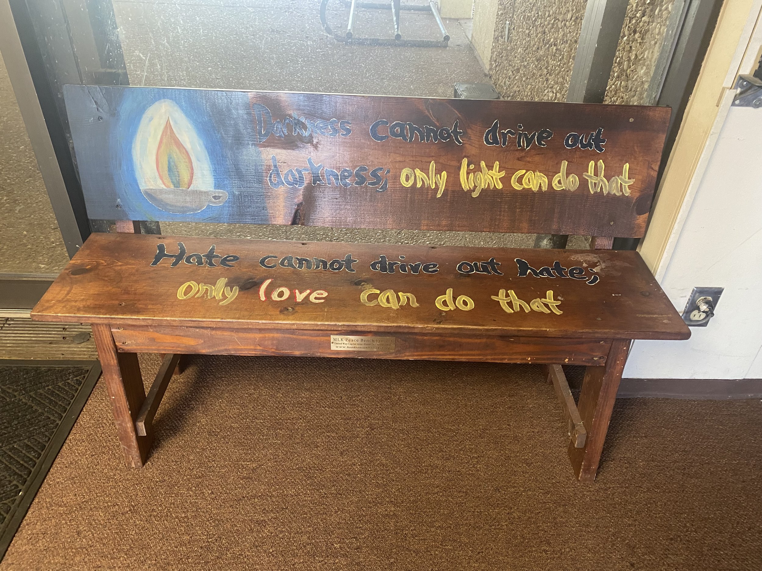
A bench in Willie Mae Branch
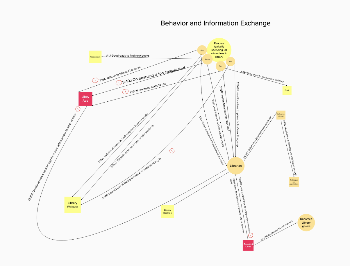
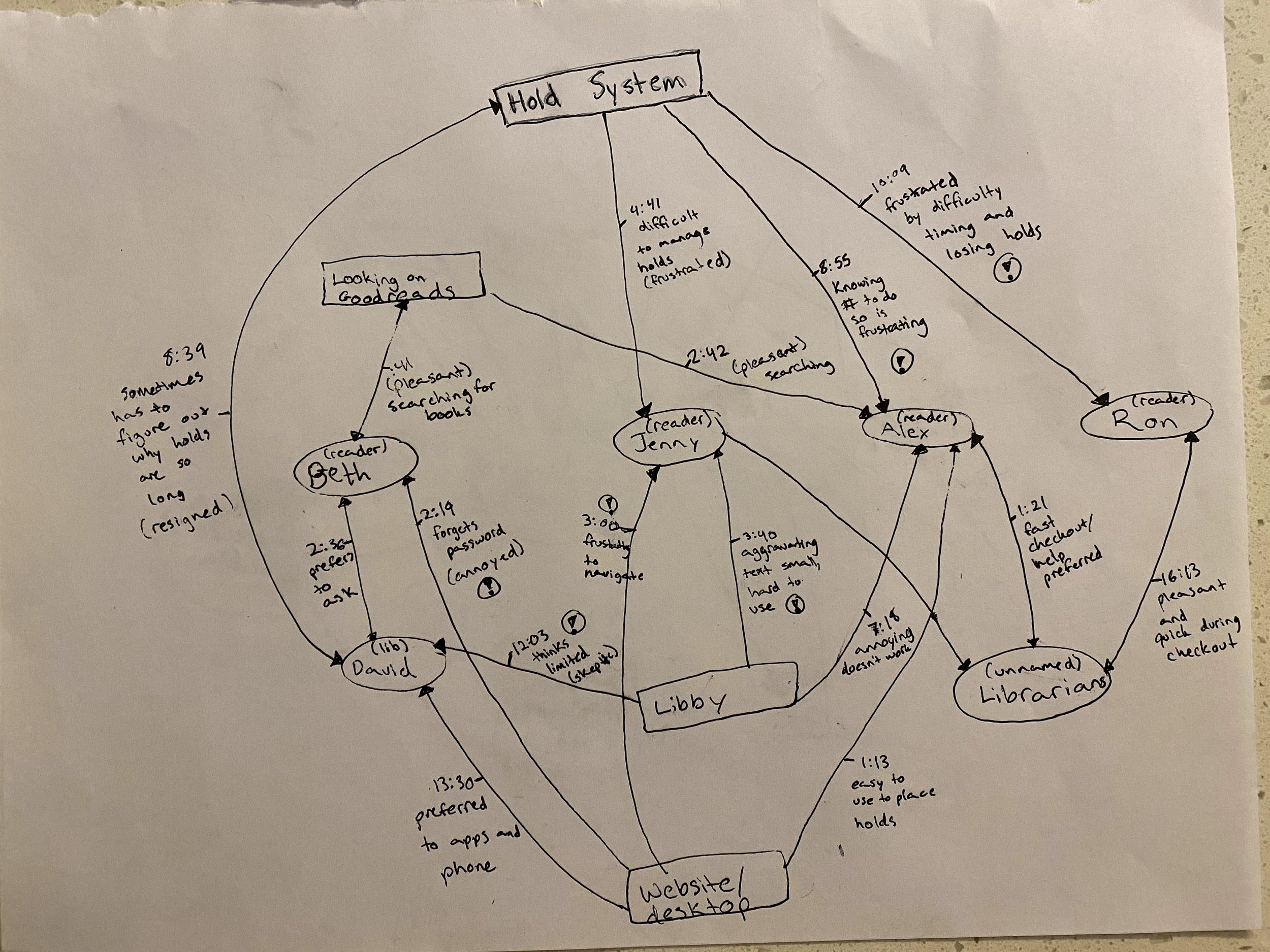
From these interviews, I began to create service slices, to map how, with who, and why patrons were interacting with policies, objects, and people within their library. Another map also showed some emotion within these interactions. Between these maps, I was able to develop a clear idea of where breakdowns within the digital and physical components of this system were. These maps more clearly showed the breakdown in ease of use of digital resources, more specifically the desktop, and the necessity of complaint cards to be filled out for refurbishments to be made to the library.
Synthesis
With all of the utterances sorted and the interactions mapped out between people, objects, and policies, I began to create a journey map out the steps what it takes to check out a book. I chose this activity because it is the main function of the library and there were some difficulties within the patrons’ experiences. The activity was distilled into steps based on the data within the interviews: finding a new book, checking out a book, placing a hold, and picking up the book. These actions served as one axis and a separate emotional axis was created to chart what each interviewee did during these steps and how they felt.
First iteration of a journey map
As the journey map developed, there were three main points in the journey that had clear emotional impact on the users. Users expressed frustration when using the library website, especially when this was completed on the desktop, due to confusing layouts and difficulty logging in. The next pain point was going to the library itself. This is where people voiced disappointment at the lack of community feeling, “dinginess” of the library, and desire for more events. The final point of interest, was an uptick in positive emotions when interacting with the librarians themselves. People felt the librarians were personal, and they were able to provide efficient assistance, than if the interviewees were to attempt a task on their own.
Final Journey Map
I also began to look into what digital resources were currently offered by the library, in comparison to the other digital resources the interviewees were currently using to create a comparative analysis. The comparative analysis helped uncover the gaps in services offered by the library and features that ought to be included as a base offered by other, similar services. The services examined included Kindle, Libby, the library website, and Audible.
Comparative Analysis
It was found that each service had:
Browsing
Social sharing and listing
Personalizing options
Samples
Progress tracking
Ebook/audiobook options
And the library’s digital services included:
Checking availability
Placing holds
Tracking Events
Checking out ebooks/audiobooks
Requesting inter-library loans
Lists
It also was apparent from the interviews, that people only accessed the digital resources for checking availability, and placing holds.
Ideation
Using the data synthesized for both the digital and physical components of this system, an area of opportunity emerged for a library app focused on creating an easier, mobile experience of digital resources to encourage more freedom and independence while using the library. As I began ideating what this app could look like, I created a value promise to help guide the mission of this product.
Value Promise:
Our goal is to provide a mobile library experience that enhances community, connection, and offers a personalized browsing experience, that’s compatible for both in the shelves or wherever else our readers go.
I began developing what flows on this app would need to do and what a ‘happy path’ toward an ideal state would need to include. The flows that I decided to develop came directly from the pain points my interviewees mentioned. They wanted an easier way to check out and place holds, a way to connect to the community within their library, and to improve their experience of spending time in the library.
Prototyping
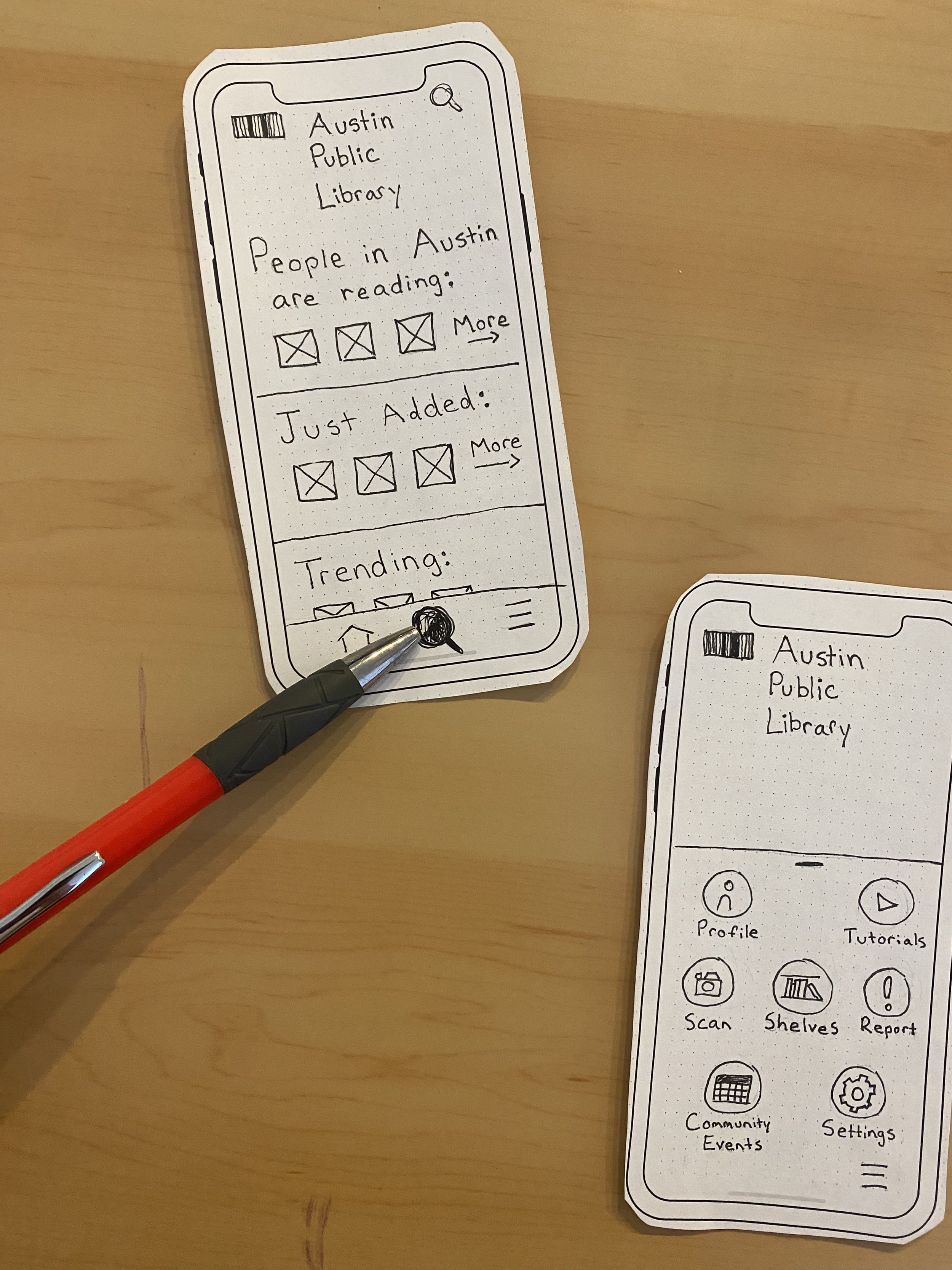
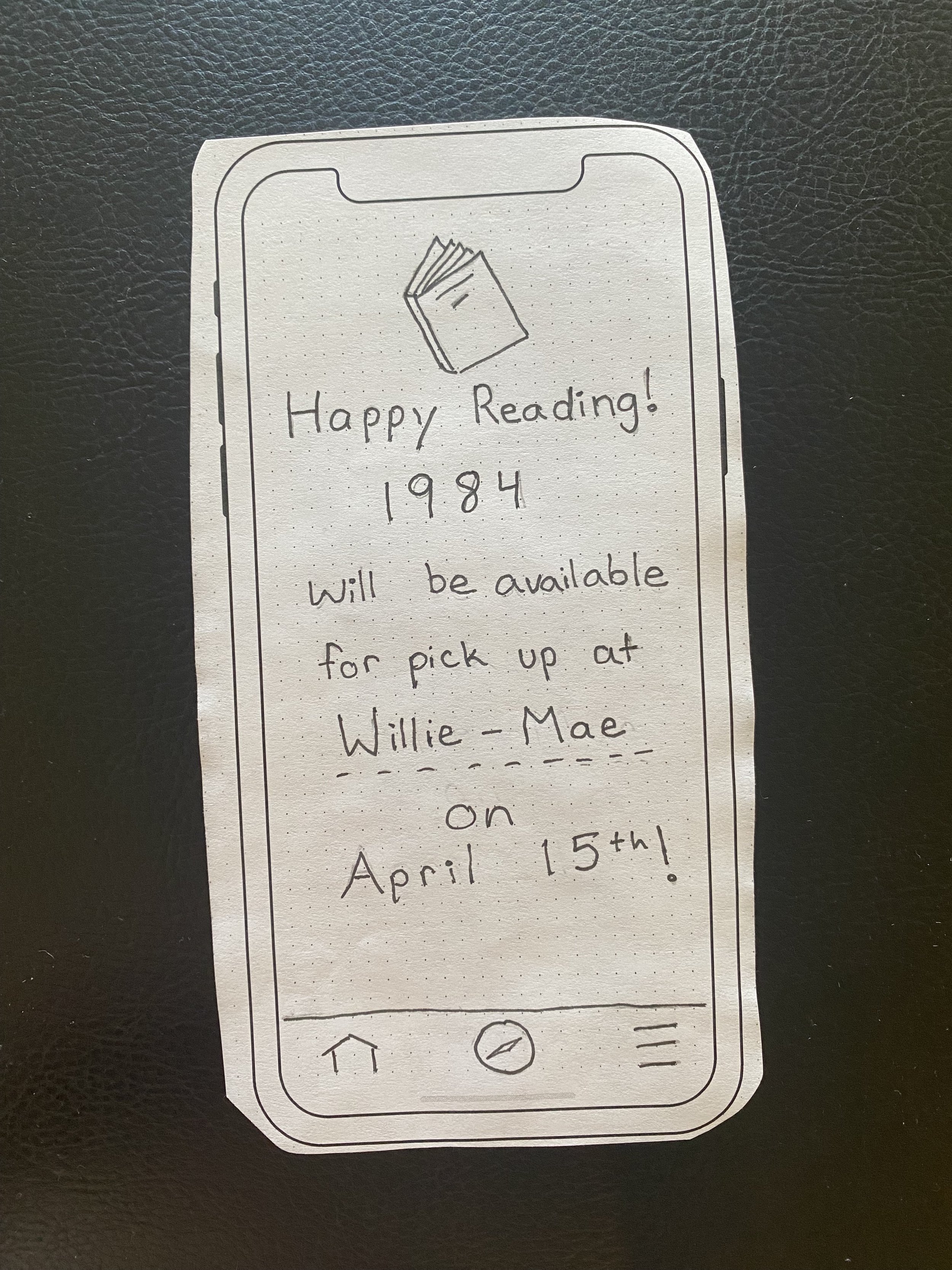
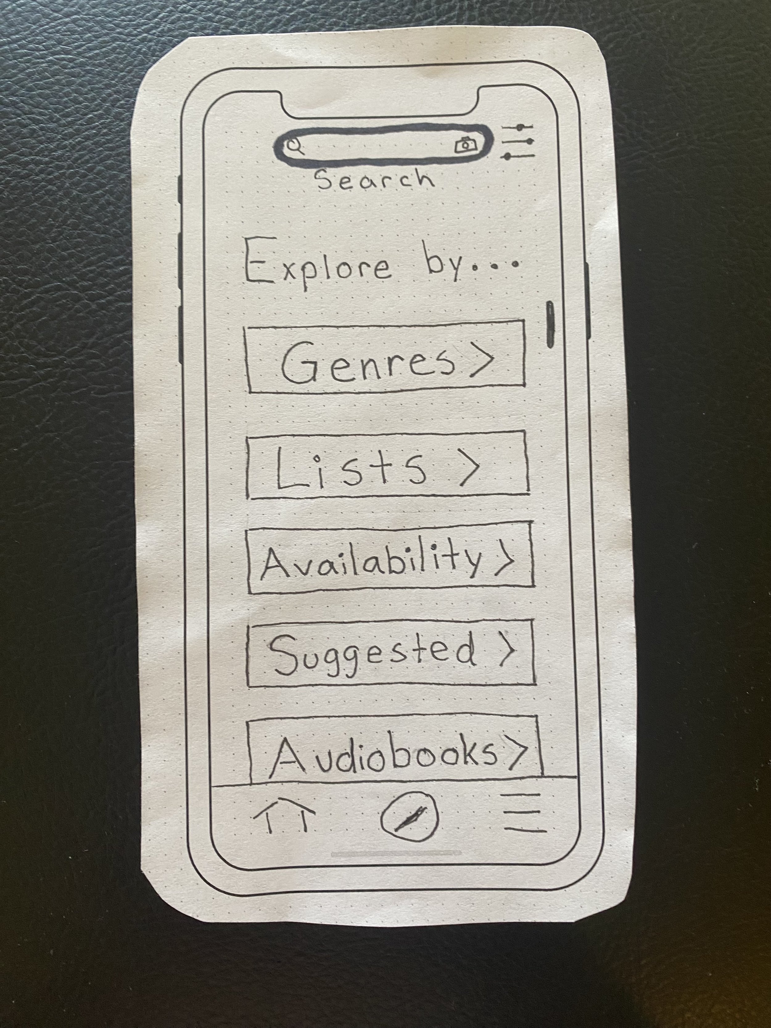
2nd round of paper prototyping
Prototyping occurred in three main phases. The first phases were rough, low fidelity to approximate which features should be included and how for each flow from the ideation phase.
The next step was to refine those initial low-fidelity paper prototypes into high fidelity paper prototypes, for an initial round of usability testing. A moderated usability test was completed with 6 participants using the Search and Check out flow, due to most participants reporting this is a key feature they use across all digital resources. The feedback at this phase was regarding the difficulty people had locating the search bar, and the cluttered appearance of the homepage. This feedback was important and the prototypes were adjusted to accommodate these changes as they were digitally prototyped in Figma.
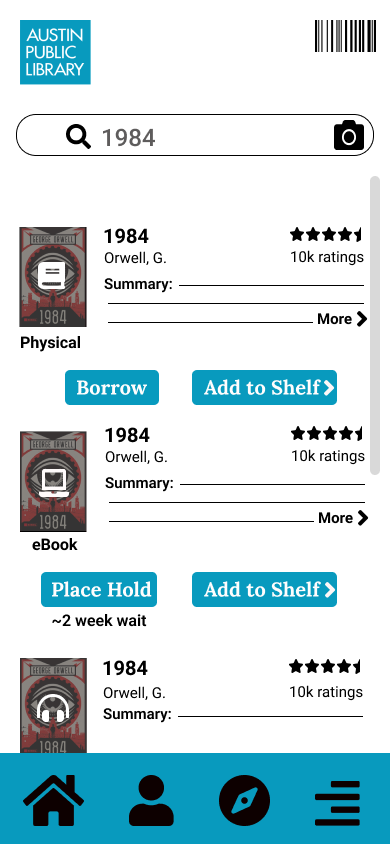
Digital Prototype
Three prototypes were created to simulate three important tasks that would address pain points mentioned in the interviews.
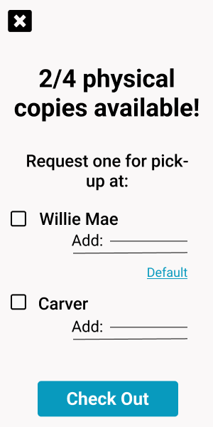
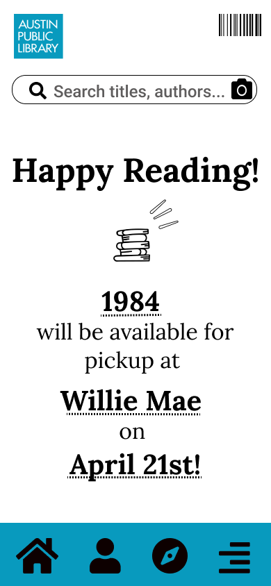
The first of which was searching and checking out a book, as people said this was frustrating to complete within the library, and as the gaps in the comparative analysis demonstrated, could be improved.
Search and Check-out
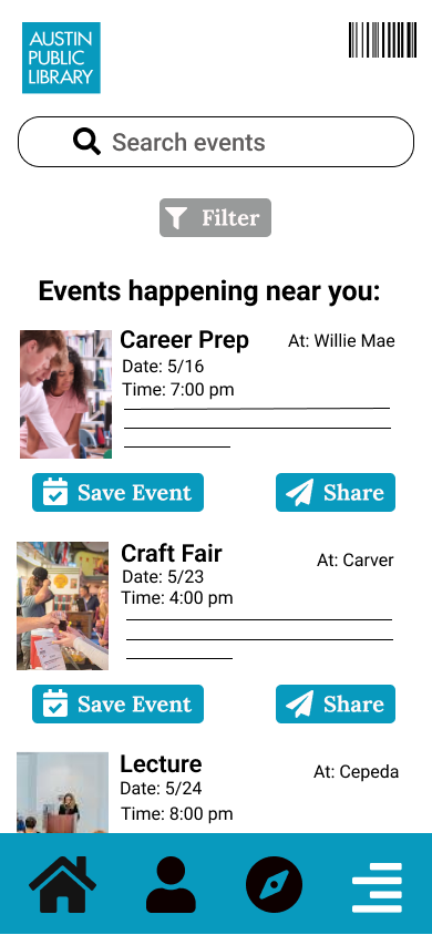
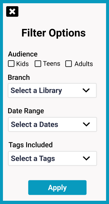
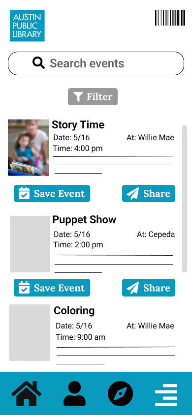
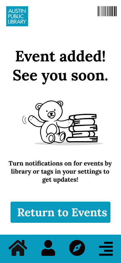
The second prototype created was for searching and saving an event, to address the lack of community interviewees expressed feeling. This flow is supposed to encourage exploring events by interest and location, with the option to share them with other people, facilitating the ease and motivation for the community to use the library as a community space.
Save an Event
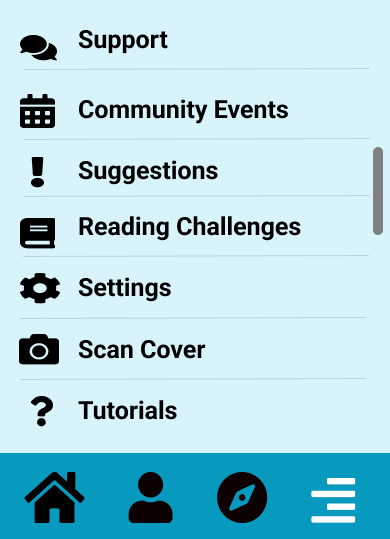
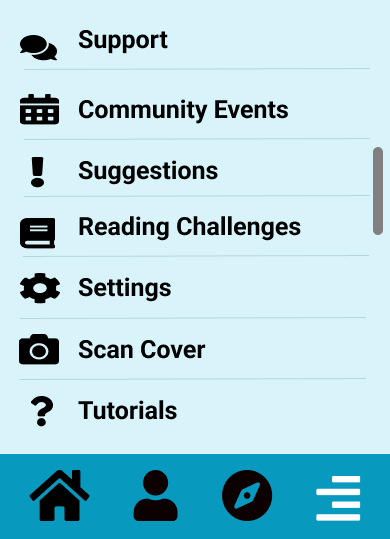
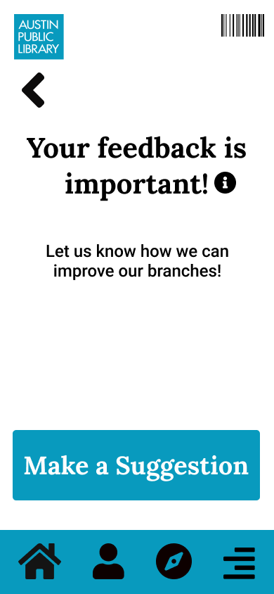
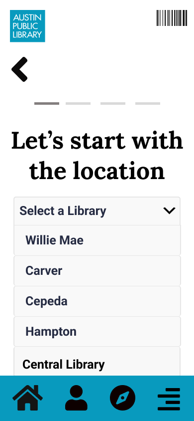
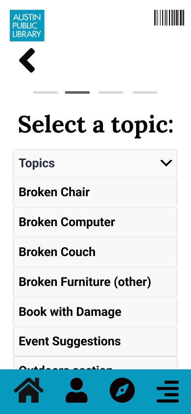
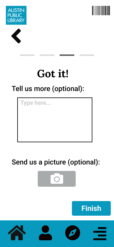
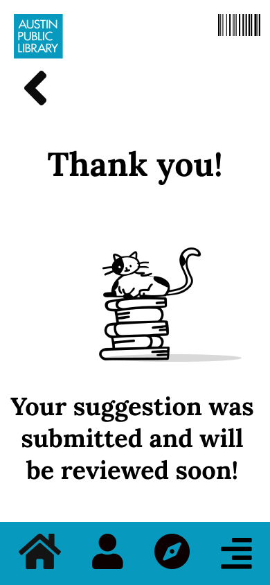
Make A Suggestion
The final flow was created to address the ‘dinginess’ of the library, which many patrons reported. David, the librarian interviewed, explained that for anything to be fixed or refurbished, a customer needs to request and fill out a complaint card with a golf pencil for things to change. He said this is largely the reason the library stays in disrepair.
Complaint Card
“It takes something, a complaint from a customer because we can’t do anything about it until someone does.”
-David
The flow was created to create an easy, efficient method for people to fill out complaints without the discomfort of requesting a card, or filling it out within the constraints of the library.
Testing
Once the digital prototypes were complete, they were uploaded to Maze, to begin unmoderated usability testing. Participants were recruited on an Austin specific internet forum and through secondary contacts, with the recruitment standard of ‘currently uses Austin Public Library’. Participants were given prompts to complete each flow, answer questions regarding ease of use and expected function of each flow, and a poll to discover what was and wasn’t working for each task.
Usability flow map from Maze results
Maze provided maps to show where people diverged from expected paths, and heatmaps to show where people clicked for analysis of each flow.
Search and Check Out Results
The heatmap feature and verbal feedback on this flow suggested several areas for improvements. People felt the medium of each book could be more clearly labeled, the language regarding checking out was unclear, and people were unclear on what could be clicked. These adjustments should be accommodated for in the next iteration of these prototypes to reduce confusion and frustration.
Save an Event Results
The results for this flow suggested participants were unclear on what they could search for, regardless of the text in the search bar. Participants wanted the search bar to extend to the entire app when searching for community events. Participants also expressed confusion with the function of both the discover button, and what was included under the hamburger feature. Participants gave feedback that the library should perhaps have it’s own page, or a grid layout on the homepage to reduce searching. This feedback should be carefully considered and iterated upon in the next version of this prototype.
Suggestion Results
Finally, participants expressed confusion over the language of ‘Suggestion’ and reported they would be unclear on the function of this flow without explanation from the prompt. This adjustment should be accommodated for in the next iteration of these prototypes.
The Future
Vignettes
The next step was to project what the app could look like, following expansion beyond the most viable product. Low-fidelity sketches, called vignettes, were created to show what features could be added or created to improve upon the current emotional state and experience of users. A total of 50 sketches were created initially, with the five ideas being iterated upon at a higher fidelity.
Some of the 50 vignettes
The vignette concept that was most in line with the value promise, was a feature that could be built off the community events page. The feature is a book club page for members to find each other and meet up at libraries hosted by their librarians, both improving the relationships of the community with each other, to their librarian, and with their library as a community space.
Final draft of one of those vignettes
Story Board
A story board was developed using the vignette for book clubs, to demonstrate the impact improving the social features could have, on both the library and it’s community to connect people in the way they feel is missing. The story was created around ‘Anna’ an Austin transplant, who’s desire for a book club mirrored what I heard interviewees reference as a point of interest in building the community they desired.
Anna is a young, Austin transplant and often uses her community library to check out books. She would like to connect more with her newfound community there, but she doesn’t feel like her library offers her many reasons to stay besides picking up her books.
This makes Anna feel isolated. Other patrons don’t spend a lot of time either because her library is in disrepair; not enough people stay long enough to fill out complaint cards, so the library is not fixed.
While browsing her library app, she notices a community events page, and sees available book clubs by genre, locations, and times and she is happy to join one that fits her schedule and love of Sci-fi.
The book club home page displays pictures of members of the club and the book of the month. She is able to meet other people in the safety of her local library and bond over a shared love of books. She has fun and forms new connections to both her community and library.
As Anna and others go to book clubs every month they create a stronger community bond, feel happier with their new friendships, explore more library content. They are also able to improve their library by filling out complaint cards as they use it. The library looks great and feels more welcoming for the community.
What can we do to help people like Anna now?
To get this app out to the community, there are a few, immediate steps that could be taken. The first is to adjust prototypes and re-test them to gauge whether the improvements based on the initial test were effective in improving clarity and ease of use. The next step would be to begin training librarians in use, to ensure a smooth roll out for the public; I learned in my interviews that people will always ask the librarians for assistance, and they would be integral to a successful roll out. Another step would be to promote use of app to the community it’s meant to serve to start connecting people in their community through a shared love of books. Stories are meant to be shared among friends, and it’s important our library is home to both: stories and friends.
Thank you!
Theory of Change: Lifelong Learning
Purpose: Social Innovation
In tech, we have no shortage of interesting problems to solve - but generally they are not important problems. I want to transition from creating products and services that solve merely interesting problems, and move towards solving problems that are also urgent and important. For these larger, more complex problems, I see design strategy & thinking as the key to building the right thing.
- Me, 5 months ago, in my SOP for AC4D
These were the thoughts I started with at AC4D and as the first quarter is winding down and I’m reflecting on what I’ve learned and how my thoughts have evolved, this topic has turned out to be an ideal prompt for documenting the understanding and the ideas so far and maybe iterate on this very writing assignment at the end of each quarter and see what has changed!
So - right now what is my Theory of Change? I think the starting point is discovering or acknowledging that change is indeed needed. That status quo is no longer acceptable and that we can no longer ignore our pain. After that acknowledgement everything looks like a messy ball of yarn and I don’t know where to begin unraveling it. I keep hearing at AC4D that there is no single place, one must just begin. In words of one of the instructors: You pull on a thread and that pulls on other threads, it’s never ending but you start to discover how interconnected things are and start to understand the relationships between them. So I will present, in a loosely organized manner some things I consider to be a part of my Theory of Change.
Discover and/or Acknowledge That Change Is Needed
Threshold of Pain
I’ve been using this metaphor lately, that we as individuals only change something when we feel pain above a certain threshold and it’s usually acute pain we respond to with swift action towards fixing it. Living in this messy world is more like chronic pain though - we’ve become used to it. It’s always there and we feel we can do nothing about it. We’ve adapted, because we’re resilient.
Whatever the reasons for finally acknowledging that change is needed - in either our personal lives or a larger sphere of existence, how might we go about it?
Seek Information To Understand
Understand Self
Our world is complex and messy because it’s made up of us humans. We are complex and messy. So let’s first understand ourselves. There are many layers to this endeavor and many areas of research as well as traditions that can assist us such as:
Meditation
Philosophy
Formulating our Core Values and General Guiding Principles in life and operating based on that
Understanding the cycle of Perception, Action and Behavior
Understanding our evolutionary biology
Sphere of Influence
It’s important to recognize our sphere of influence so we don’t get overwhelmed and we don’t waste our energy towards something that truly is outside our influence.
Sphere of Empathy
It’s important to recognize how far out does our empathy go? How big or small is our tribe that we truly and actively care about? Has it changed in recent years?
One of the ways of helping someone who might be on a different part of the political spectrum as us is by helping them expand their sphere of empathy. We humans, we do care about fellow humans, we just like to draw a line and that is such an ingrained part of us that it can’t be erased completely but we can keep recognizing it and keep expanding it.
Understand Communities
Just as we can understand ourselves through the lens of science (neuroscience, evolutionary biology, psychology, sociology) we can also understand why we behave the way we do in our core groups. How do we form these relationships?
Understand Societies
Taking the exploration a step further - we can understand better why all societies have some common shortfalls and why we in large numbers have certain predictable patterns and how might we break out of those patterns?
We as individuals, with the ‘errors’ in our thinking along with our beliefs and desires and skills - we collect in groups and manipulate the world around us. In our groups (tribes) the errors have an additive effect and the distance between tribes continues to grow. By understanding ourselves in isolation and in different contexts as well as understanding society better - we might be able to reframe problems in ways that we can then solve or at-least make progress towards solving.
Power, Ethics, Morality & Justice
The learning, defining and implementing of these will never be complete.
[I’ll be using the definitions of these concepts from Laura Weinsteing and Leyla Acaroglu’s writings]
Power is the ability to influence outcomes.
Ethical conventions are the product of social dialogue and debate resulting in a normalized collective agreement of approaches that fit the most humans for the most benefit.
Someone with good intentions for the work and changes they want to implement but with a big power imbalance:
In the best worst-case scenario we might see low adoption for an ineffective solution because it was based on too many assumptions
In the worst worst-case scenario we’ll be creating a new flavor of colonization.
In one of the classes for AC4D this quarter I took a deep dive into the period of the Russian Revolution. It was one of the most successful revolutions, perhaps the only successful revolution (both times, the governments were overthrown and the revolutionaries came to power to implement whatever the heck they wanted) but very quickly the revolutionaries who were in positions of authority, particularly the leader of the movement started committing the same atrocities in the name of protecting the revolution. No where in their manifesto one could have read the vision and drawn a line to the realities of its implementation. What was the problem then? I think power. I think the failure of the revolution and Lenin as a human being is a beautiful example of absolute power corrupting somebody.
There’s a question that I answered for myself after that project. A question that was always in the abstract and never needed to be answered until that day I finished processing my thoughts about the Russian Revolution. My answer to the question “Do the ends justify the means?” is “No. They do not.”
As anyone contemplates and moves towards making revolutionary changes, just a friendly reminder: don’t become a power elite. Definitely don’t become Lenin.
Let’s Not Be Fearful of Technology Itself
The technology that we’re most fearful of right now is AI.
Intelligence itself is benign. Unless we purposefully build in selfish drives, motivations, and emotions, intelligent machines will not pose a risk to our survival.
Human intelligence however is not benign. The possibility that human behavior might lead to our demise has been recognized for a long time. Since 1947 the Bulletin of Atomic Scientists have maintained the Doomsday Clock to highlight how close we are to making Earth uninhabitable and Climate Change was added in 2007 as a second potential to cause great human suffering.
An excerpt from one of my favorite books, A Thousand Brains.
A poem that expressed something similar:
No matter how completely technics relies
upon the objective procedures of the
sciences, it does not form an independent
system, like the universe; it exists as
an element in human culture and it
promises well or ill as the social groups
that exploit it promise well or ill. The
machine itself makes no demands and holds
out no promises: it is the human spirit
that makes demands and keeps promises.
Lewis Mumford
Technics and Civilization
It is scary - there are many ways in which we might self-destruct but I don’t think we should fear technology - we should fear ourselves and prevent the scenarios that lead to the behaviors and decisions that lead to the outcome that we want to avoid.
I do not (at this time - I reserve the right to change my mind about this) propose going back to primitive existence. As lovely as it sounds sometimes - I’ve romanticized it because I feel very much at one with nature when I’m surrounded by it and past me (who was somewhat anti-social) wanted to be a true hermit. But, a complete rejection of society may be a solution for some individuals but is not a solution for our species. It is in our nature, evolutionary biology, to create, to solve problems and to form groups and cooperate for mutual benefit. We just need to do it better. We need to grow our tribes and our spheres of empathy. We need to lift up more people with the advancements we collectively make. We need to do that without further harming the flora and fauna of our planet.
We Need To Live In Balance: Civilization & Mother Nature
We have this really odd place in nature, as an apex Predator who can’t give up being the apex predator but who is aware of its own and the suffering of all living organisms due to that position.
Be a Designer. You Already Are.
“Design can be used as a catalyst for positive change, but much design is done without the intent to create outcomes that do so. As a result, we end up living with things we don’t need, and solving problems that don’t exist…” - Leyla Acaroglu
I read a tweet one time that captures this feeling as well: “The world is a museum of people’s passion projects” - how exciting and terrifying.
One of my classmates brought up passion and what its role might be in designing the world. I think passion is a necessary factor in the starting (and for sustaining) conditions for an individual to take action and participate in the world in things that don’t offer instant gratification. And act at a level and in a way that affects it. Passion isn’t sufficient though. One also needs tools to channel and focus that passion.
So, could we as individuals and groups affect the world with passion and tools? Absolutely.
We also affect the world, design the world by not doing anything. Choosing inaction is doing something so, certainly if one is passionate and learned the tools to apply to any part of our individual or collective experience, we would effect change in those areas BUT is that a good change? What is the change we’re intending to make? Who decides what changes we should / must make? These are the next and more difficult questions that I’m now learning to think about.
Before these eight weeks at AC4D, I thought this was not that difficult a question. You just go out there and work towards changing things that you find to be not serving humanity. As someone who is in the minority in this country and has lived in places where I might belong in the majority but are a former colony - I thought, or not thought, intuitively felt that I had enough perspective and empathy to choose changes appropriately and fairly.
That intuition has been shaken and undone a part of the AC4D’s first quarter and particularly the class on Public Sector, Innovation & Impact.
I felt qualified and equipped because I’ve been oppressed and when my own privilege and socio-economic status has perpetuated injustices and inequalities in the caste-based Indian society, I’ve recognized it. I’ve talked to friends and family about it to understand it in a deeper way and tried to think of what decisions at individual / family levels need to be changed in light of that learning. But - there was a before and after for that learning and acknowledging.
If I - someone who has experienced oppression at a large time scale (ancestry) and in the present through the world we inherited and has experienced inequality (gender) and sexism and has experienced the harmful artifacts of patriarchy, and all of these in two flavors - Indian and American - could have had blindspots about how in ways I exist and interact with the world can harm people with different histories than myself and different lived experiences from myself - then on principle I must not operate based on my judgment and intuition. I need a process I can apply often.
It’s kind of like the cognitive biases - they don’t happen because of lack of raw intelligence or lack of good values. Cognitive biases are not the same as mistakes either. These are interesting artifacts of the human mind because of our evolutionary biology and because of the way our fast and slow thinking - the two modes of thinking we have, interface. We can learn about cognitive biases and slow down and apply the knowledge to minimize them in our decision making but learning about them doesn’t change the underlying mind and its processes that lead to them. We have to live with our old brain (primitive brain / lizard brain).
So similarly at the level of thinking about complex things - we need to slow down and utilize the slow thinking mode (along with the tools that I’m learning at AC4D) instead of relying on our instincts.
Judgment and intuition will improve with time as I learn more about and apply design justice principles but the first step is to have a process that doesn’t rely on intuition and let go of the attachment with some previously envisioned worlds. I’ll rediscover them again through the new process if these are good visions to work towards.
I shudder as I think about the colonizers believing they were doing good in the world.
Scale is an interesting and complicating factor.
If we only operate from values, at an individual level, we might not cause harm but at scale it’s important to see that good, empathetic, aware individuals can also cause harm and harmful ripple effects so we need to understand the complexities at systems levels and learn from the various ripple effects and unintended consequences that we live in, that were triggered 50, 100, 200 years ago.
I see Design Justice as a framework that compliments training of rationality and refining of our collective core values.
“Everything in the material world leaves a mark on us as humans, on the species we share this planet with, and on the cognitive experiences that we collectively experience.” - Victor Papanek
Using DJN principles, design methodology that leans towards participatory design and tools like Equalizer Cards, there is hope that we might break out of the cycle of designing systems of further oppression.
PS: A Love Letter to Humanity
I had a lovely conversation with someone who is working towards improving access to the outdoors and I want to share their words because of how beautifully they summarized the conversation thread about how we could bring about change without repeating mistakes of the past, which is:
Love. Love needs to be one of the core values.
If Love is one of the guiding principles, kindness will be an outward expression of it. Genuine care of fellow humans will be an outward expression of it.
I feel that.
No matter the complexity, the levels of awareness and tribal loyalties - if people moved in the world from a place of love and compassion, we might be able to untangle ourselves a little from this messy, wicked ball of yarn and be closer as people and feel less threatened by each other.
I’m in love with humanity and this is why when I zoom out and look at the world and its complexities - I feel more energized & grateful than depressed or daunted.
Experiencing awe often also helps tip the scale on the side of a healthy perspective for me.
As a species that has only existed for a blink of an eye in the last 24 hours of the existence of the universe, we’ve been incredibly destructive. At the very least, we’ll keep course correcting and I’d love it if we made it.
References & Tools
DJN
Equalizer Cards
Laura Weinsteing’s writings
Leyla Acaroglu’s writings
My Core Values
[I’m feeling the itch to update / refine these]
Curiosity & Truth
Learn as much as I can about as much as I can
Secular Rationality
Believe more true things than false things
Seek information often to update my mental models
Help others also believe more true things than false things
Compassion
Build it and practice it
(It doesn’t always come naturally)
Awe & Beauty
See the awe & beauty everywhere
(This is what keeps me healthy more than anything else)
Connect deeply with people
Ask difficult questions
Share difficult things
Create nucleation sites in people’s minds
Contribute to my Communities
(I’m still finding them)
My Philosophy / Inspiration Lineage
These books have greatly affected the way I think about change and the information I seek to further understand the world. I might not have quoted direct thoughts but as a new practice I’ve adopted from one of my classes at AC4D, whenever I create something, I try to note down the lineage of the inspiration for it. These books have fueled my mind and will continue to (most of these books were 30-50% completed and I find re-reads are very helpful)
Jonathan Livingston Seagull
[From 2008. That’s the earliest I could trace back the thread in my mind about wanting to change something in my life and this simple book helped me take action]
Storms of My Grandchildren
Churning The Earth
Zen and the Art of Motorcycle Maintenance
When Breath Becomes Air
We Were Eight Years In Power
How To Change Your Mind
How To Really Change Your Mind
Irrationality
Whole Earth Discipline
Algorithms To Live By
A Thousand Brains
Moral Tribes
Minds Make Societies
Jacobin Publication
America By Design
Design Justice
[the most recent addition to the list]
Side note - The discovery of each of the books is a story in itself. People who introduced me to it, places where I found it, dots it connected at the time. I wish I had written it all down.
Podcasts
Hidden Brain
The Huberman Lab
What additional topics do I want to learn more about? I’m sure there are other missing pieces of the puzzle that is ‘Effecting Change’, but two areas I want to focus on next:
Systems Thinking
Indigenous Philosophies and Wisdom
Gratitude (not an exhaustive list :))
People of Orro - my former work family
For four years this place provided a living example of going against the grain of industry wide culture in many ways. An average tech company (traditional or startup) isn’t quite as kind, warm and people focussed as Orro was. I want to live in a world where the culture we had as a group is the norm.
People of Try Hard Coffee
It’s a community focused coffee shop that I love to support. There is no place like it really. It is my creative sanctuary and I feel gratitude for the existence of this place everyday. I’ve had lovely conversations with people who work there and people who are regulars there. A minute long conversation has fueled pages of writing at times.
Observing and listening: Theory of Change
Back in 2016, when I decided to pursue a design career, I was not expecting my work to have such impact, by saying this I’m not trying to compliment myself (far from it). Instead I will -try to- look into how little decisions can have big impact on other people.
Beginnings
When I formally started working as a designer, I used to work in a product which allowed users to manage their bank accounts, and I did so thinking mostly on a surface level, then I was told what I designed and then built was being actively used by over a million people monthly, which surprised me at the time, and opened my eyes into how can a little decision can have great impact when a user is interacting with it.
Take for example when we launched Plin, which is a popular P2P payment solution in Peru. The first iteration of said product did not include a payment confirmation with enough details to be shared to the person you’ve paid. This obviously brought backlash from users who said information provided on this confirmation screen is not enough to work as a proof of payment. We then were able to come out with a fix a month later.
The point I’m trying to make here is, as a junior Designer, I didn’t think much about that confirmation screen, to my eyes (and with all context at hand) it was enough, and it served the purpose. But what we saw when we went live was the opposite.
Empathizing
Users don’t see a product deconstructed screen by screen on a design file. They experience it with little context, exploring at first until they become comfortable enough to attain mastery using it.
This same concept can be applied to how society works, we as citizens do not have enough context on why a certain decision was made, until we have a negative experience with it, and its then when we often think “Aaargh, why does it has to be this way?”
I think we can safely assume the way society works today is a collective of traditions, new trends being pushed, and rules that made sense to someone a long time ago, thinking of it as if citizens were always following a ‘happy path’, which is a term used in design to describe a set of staged actions. That obviously does not apply to real life.
First was noticing
It wasn’t until 2019 when I started to think about what can one do from its side to make a change, first a bit of context:
I live in Lima, Peru, and here, rules are not followed as much as one would like, to the point that one feels as if you are required to break them as people tend to do in order to get somewhere. So I thought about being the change, this included trying to comply with the system with little actions albeit insignificant and very trivial, I was convinced this was a great first step to start the change.
It is embedded into the system
So you have a naive version of me, trying to change little by little to what (to my eyes) was ‘right’, ignoring that the way the system is designed and established so deep it’s very hard to achieve change, though, not impossible I would say.
As Arturo Escobar states on his Presentation at the RISD faculty
“Civilizational crisis, of the current model of civilitazion, climate, energy, poverty etc, is the largest framework in which we can think and re-think design.”
When I heard this talk initially, it clicked! The first thing that came to mind is how the little changes I talked about earlier connect with a re-thinking of society, and how can we make sure to include design justice, principles design and overall include design as a praxis of worldling.
And this thinking also provoked a questioning of who gets to have the power in a society, holds such responsibility which in a context like the one in Peru I talked about, can be frustrating to think about, let alone act on them.
Which connects with Sasha Costanza-Chock’s: Design Justice: Towards an Intersectional Feminist Framework for Design Theory and Practice a piece which focuses on the ways design challenges the matrix of domination (white supremacy, heteropatriarchy, capitalism, and settler colonialism).
So… how can our work have impact?
If you were to ask the 2019 me, I would’ve answered (unconsciously) that the work that I’m doing is impactful, when in reality, it was at a very surface level, directly to the interface. Thanks to the program at AC4D, I gained a deeper understanding into systemic changes, which made me realize I need to take a more holistic approach.
And to this point, I have noticed I want to affect change at the system level, by promoting collaboration and co-creation. Working with people from all backgrounds and perspectives, I believe this way we can design more inclusive, effective and sustainable solutions.
Design justice is a key tool we need to take into account when thinking about new or existing solutions, this way we can ensure a more equitable distribution of pros and cons, meaningful participation in design decisions, and recognize community based traditions, knowledge and practice, this way we don’t impose what we think the solution should be, or expecting people to adapt, change traditions in function of a product, but rather, have the product or solution adapt to them.
What’s next?
I wouldn’t want to finish this article by highlighting how valuable discussing these topics at Theory class were. It is one of the activities I enjoyed the most during out first quarter. It made me look into my self and re think everything that was established in my mindset, whether that is for good or bad.
And this enjoyment is what ultimately made me realize the program at AC4D is uncovering a passion I did not know I had, systemic design, how can we rethink whats established, update the mindset and ultimately drive towards a better, equal and fair world.
Theory of Change: My Kids as Motivation
On November 7th, 2014, the greatest theatrical space odyssey ever created (in my opinion) was released to the world: Interstellar. Five days earlier, on November 2nd, I embarked on one of the greatest earthly odysseys possible: I became a father to a baby girl.
Though these two events seem unrelated, to me they are as intertwined as space and time.
Interstellar tells the story of an astronaut father who goes on a mission to another galaxy to find a habitable planet for humans to occupy, all the while desperately longing to get home to his daughter whom he promised he would return to.
It’s not a coincidence that this movie had such a profound impact on me. As a self-proclaimed deep thinker, it sparked a level of curiosity in me that I had never reached before. Terms like “black hole” and “relativity” filled my imagination, and took up the majority of my Google searches.
And as a new father, it pulled strongly on my heartstrings. I had always felt a sense of awe and wonder looking up at the stars. Now I felt the same way looking at her. It’s like she was a reflection of the cosmos, and the cosmos were a reflection of her. (Could a father-daughter dynamic set in space be more spot on?)
Essentially, Interstellar was the right movie for me at the right time because it blended the feelings of love and interconnectedness to create a newfound sense of stewardship.
Fast forward to the early summer of 2020, and my wife is about seven months pregnant with our second child. Although we didn’t know the sex of the baby at the time - we wanted a labor day surprise - the possibility of this baby being a boy started to become real when questions about manhood and masculinity began flooding my brain:
What does it mean to be a man? How am I going to teach my son about being a man when I never had a positive example? What is my role as a man (father, husband, earthling, etc.)?
Without a real starting point I went looking for answers, and lucked out when I happened upon the greatest book on Men’s Gender Studies ever written (in my opinion), Fire in the Belly: On Being a Man.
Written in 1992 by Sam Keen, a philosophy professor turned “skilled explorer”, Fire in the Belly completely dismantles the outdated models of masculinity we’ve come to accept as normal in our modern society, and offers a healthy vision for what men can be. Needless to say, it blew my mind.
It was the right book at the right time because it awoke a sense of activism in me that coupled perfectly with the sense of stewardship that Interstellar had provided nearly six years earlier.
June and July went by quickly, and on August 2nd we welcomed our baby boy into the world. Keen’s words were still rattling my core. Specifically, a single declarative sentence perfectly matched how I was feeling:
“The historical challenge for modern men is clear - to discover a peaceful form of virility and to create an ecological commonwealth, to become fierce gentlemen” (Keen).
Challenge accepted… but I was still missing a key ingredient.
Fatherhood, above all else, fuels my theory of change. Having kids is like signing your initials into the universe’s proverbial wet cement. It immortalizes you, telling everyone else “I was here.” However, with this immortalization comes responsibility: it’s one thing to want to become a fierce gentleman; it’s a whole other thing to truly exemplify one.
Earth, our home, will be around for another five billion (5,000,000,000) years. Yet each of us, if we’re lucky enough, will only get to experience about 80 of those years. Simple math tells us that, relative to cosmological time, we only have an atomically small amount of time here, so what we choose to do matters.
Luckily, design, the once missing ingredient, is now providing me with the skillset to do what matters: instilling a sense of stewardship and activism in my kids. There isn’t a playbook to do this. And, as we’ve seen, sometimes inspiration can come from unlikely sources at unlikely times. But what I’m gathering through design is a new way of thinking, a mental model, a lens to see the world that I can pass on.
Design = Stewardship + Activism
Ironically, one way to see the world is through the lens of science fiction. (Have I mentioned Interstellar?) In her essay Rewriting The Future: Using Science Fiction To Re-Envision Justice, educator, writer, public scholar, and spoken word artist, Walida Imarisha, states that science fiction “allows us to imagine possibilities outside of what exists today” (Imarisha).
On top of giving me a new perspective, design provides me with a sense of positivity and optimism because, at its core, it’s also a creative problem solving methodology.
Sometimes I ruminate about questions such as What kind of world did I bring my kids into? and Will my kids be part of the last generation of humans? Naturally, bleak questions tend to have bleak answers. Looking at these questions through Imarisha’s eyes or through the eyes of a designer, however, there is less bleakness and more possibility. No problem seems wicked enough.
Another element related to science fiction, specifically in relation to space and time, is serendipity. Both instances, watching Interstellar and reading Fire in the Belly, felt like a scene in a movie when a series of seemingly inconsequential events culminates into a grand climax.
In their piece, The Relational Work of Systems Change, Kania, Milligan, and Zerta define serendipity as “being present to the work and to each other… grounding the work, individually and collectively, in love” (Kania, Milligan, and Zerta). Again, it’s not a coincidence that, in the realm of Interstellar, “the one thing we’re capable of perceiving that transcends dimensions of time and space” is love (Nolan, Interstellar, 2014). It seems that by welcoming serendipity, design gives you permission to allow magical moments to happen.
Design = Imagined Possibilities + Serendipity
Ultimately, I don’t yet know the impact I want to make in the world. I do know, however, that I want to zoom in and out between the micro (at the level of a newborn baby) and the macro (at a “cosmic” level), to tackle everything from individual issues to systemic problems.
Design may take me anywhere. I just hope the journey involves my two North Stars, my kids, giving me the chance to exemplify what it means to be a father, including being a fierce gentleman, a steward, and an activist.
My Theory of Change: From Healthcare to Design
If you had asked me 10 years ago, I never would have expected myself to be in design school. In fact, I am not sure if I recognized design as a tool for inspiring change. When I was 18 years old, I decided that I was interested in health and working with people. I therefore decided to pursue a career in Physical Therapy. At the time, I dreamed of being able to take those skills and work with children and underserved communities around the world. I thought one day, I would maybe study public health, as I was passionate about access to community health resources. Throughout school, I resonated more with the role of working with people, rather than the rote memorization of anatomy and body mechanics. Our teachers taught us how to prevent burnout and practice ethically, but this was just the beginning of understanding and experiencing a corrupt system that ultimately led me towards a career in design.
In this post, I will discuss the challenges I faced while working in healthcare, my attempts to improve situations, and how design frameworks I learned at AC4D have altered my perception of the potential for change. Throughout this paper, I will be using the design justice principles to reflect on my experience.
While in physical therapy school, I believed that my profession was a way to make positive change in the world. As I began my career as a Physical Therapist, I worked in various settings all over the country. I found that my passion lay in connecting with the patients I worked with. I quickly began learning about people from all walks of life and hearing their stories, furthering my understanding of the world and gaining perspectives. I did my best to make people feel listened to, knowing that the hospital is not a place of comfort for everyone.
One of the biggest issues that patients shared with me was that they often did not feel listened to by clinicians and therefore felt powerless in their care. Hearing this feedback from patients influenced my practice, which was to actively listen to their stories and get to know their individual selves during each physical therapy session. As I have learned more about design justice principles, the following one came to mind:
“We believe that everyone is an expert based on their own lived experience, and that we all have unique and brilliant contributions to bring to a design process.”
I think there is often a power dynamic between the doctor and the patient that makes the people feel powerless, when really, they know their body more than anyone else in the room. If healthcare prioritized this design principle, we would listen to patients and understand where they were coming from before making recommendations that do not align with their values, culture, or what just doesn't work for them. While people have good intentions going into healthcare, the lack of listening is a symptom of the “one method fits all” fallacy, as well as overworked clinicians who are experiencing empathy fatigue.
While working in healthcare, I tried to make changes by learning the thoughts and needs of my patients and trying to advocate for them to managers and physicians so that they got what they needed to be safe. During my longest hospital tenure, we had many unfunded homeless patients who were being released onto the streets upon discharge from the hospital. I often had to jump through hoops to make sure they got what they needed and that they were discharged when it was safe for them to leave the hospital.
Change is hard to make in a hospital setting. Oftentimes, as an employee providing direct patient care, you feel powerless when it comes to making changes. It is frustrating dealing with upper management, who often have no experience working on the ground level, but ultimately make all of the decisions without a full understanding of the issues at hand. In my time as a physical therapist, we were often given unrealistic expectations for my productivity standards while upper management simultaneously tried to empathize with us. Our managers knew that these expectations were difficult, but rather than advocating for us, they would educate us in ways to look more productive on paper, often promoting unethical practices. We would have annual surveys where we would express what we felt needed to change, but nothing seemed to happen. These resulted in the staff feeling powerless and no longer attempting to make changes or switching companies or careers. Recalling these experiences reminded me of the following design principle:
“We prioritize design’s impact on the community over the intentions of the designer.”
Consider substituting “designer” for “hospital” in this scenario. If upper management prioritized the impact that the staff providing direct patient care has on the community rather than the intentions of the hospital (which are always based on profit and staff retention), this would likely result in better care for the patients and job satisfaction of the care providers. It is deeply important that people feel listened to, including the staff and the patients. The Power Mapping exercise we learned from the co-design Equalizer cards by Lauren Weinstein could be a powerful guiding principle to see where dynamics could be shifted for the patient and the employees providing direct patient care.
Furthermore, the lack of equity that exists in healthcare needs to be addressed when we think about the future. Everyone should have equal opportunity to access health resources despite their lack of privilege. People have different abilities to access healthcare and health prevention resources as a result of economics, gender, sexual identity, race, etc. This reminded me of the design justice principle:
“We use design to sustain, heal, and empower our communities, as well as to seek liberation from exploitative and oppressive systems.”
It is clear that discrimination occurs within hospital settings, both against the patients as well as the staff. This stems from a lack of empathy and understanding, culminating from a “one size fits all” approach to providing care. Healthcare needs to be approached at an individual level, and the current approach of treating everyone the same way lacks understanding that we all have different privileges in regards to health. In the future, I would love to see more learning opportunities for staff to help increase understanding of community issues resulting in people not receiving equitable care. Ultimately, the more connected leadership is to the patients and staff, the better the outcomes will be.
What I learned from these experiences in healthcare informed the ultimate change that I now believe is necessary in the United States:
Healthcare should be recognized as a human right, not a privilege. The current system profits off of individuals' poor health, which leads to further inequity. We should focus on accessible preventative resources to improve equity in healthcare as well as a reform of the entire system. Our healthcare system in its current state is unsustainable, and a radical shift needs to be made.
In the future, I hope to inspire change for more equity in the world. Currently, people choose not to see doctors out of fear of being judged or not understanding insurance and fear of owing more than they can afford. A redesign of the healthcare system in the United States will be necessary for an equitable future, and using co-design principles would create the best solution for the community.
So my most recent decision to inspire change was the decision to leave healthcare to work towards a career in design, inspired by the change I hope to see in the world. I am confident in saying that I do not regret my experience as a physical therapist. I was able to connect, empathize, and learn from individuals that I will truly never forget – people that I likely never would have crossed paths with otherwise. They taught me more than just my experience; they taught me about all the different lives they have lived and how they experience the world. I hope to carry these experiences with me as I enter the design realm. I want to continue learning people’s stories, understanding more about their individual experiences in the world, and help make actionable changes to make people’s lives easier.
During my time at AC4D, I aim to gain as many skills as possible to jump into the design field. I have been finding my voice and learning how to effectively communicate and inspire change. I must unlearn practices and thought patterns that do not create an equitable future and replace them with the ones that do. My theories of change have inspired a passion to express my thoughts while being open to listening about people’s differing perspectives. I will continue to use my skills of working directly with the community and also practice zooming out to see more of the big picture. I plan to incorporate design justice principles and co-design practices in my future design work.
References:
Theory of Change: The March
My theory of change of has, perhaps unsurprisingly, shifted drastically in the recent years. As I child, I understood change to be inevitable, a slow march forward without giving us much agency in choosing direction. As I grew older and began carefully laying the tracks for my life, I chose a career based on the direction I wanted that slow march to continue; I wanted to dedicate my life to healing and helping people, one person at a time. I believed through these singular exchanges, and the ripple effects of positivity and goodness they cause, the world changes for the better, if not for just one person’s world. I worked this way for a while, a part of a team that helped people in some of their worst moments of their lives, doing sometimes challenging but immensely fulfilling work. I will always cherish that work and I believe those small scale changes keep the world alive and turning. However, the Pandemic has made me reevaluate the sustainability and price of these changes when the institutions they exist within are built to deter or profit from them.
The healthcare industry had always had some ethical quagmires, but I believed every industry did, and caring for people outweighed these issues. During the Pandemic, I was forced to confront that the change I wished to effect was often in spite of the industry I worked within. Patient care was hindered by stretched staff and company instituted time constraints, patients and staff alike passed away from the disease, and masks calloused faces. Chick-Fil-A was left in the staffroom as hazard pay, time off for COVID was reduced to five days, pots and pans clanked on. Eventually the pots and pans stopped, we were left to carry on, and the facility had a great quarter. I came to the realization that I was helping but the march came at a price and was unsustainable. In the ‘unprecedented times’ the solutions, the movements for better treatment of healthcare workers were wholly precedented and neglected the needs of healthcare workers. We were willing to step over each other to continue our marching orders.
I began to see this in reflected in other institutions as well: cheap, placatory solutions meted by people with the means and power to assert their solutions and changes were the only ones possible. It became more clear to me that change needs to exist in both arenas with equal strength; if our institutions and environments don’t support behaviors and qualities we want to see in the world, the changes we create on a smaller scale are limited in impact. Similarly, without small scale changes occurring to support it on an everyday basis, large scale change on an institutional level feels disingenuous and worthless.
The decision to leave healthcare was difficult, a bad break up. I ultimately left, as did several of my colleagues, feeling as though saying ‘no’ to a system I no longer believed in was it’s own method of effecting change. In “Design’s Lost Generation” Mike Monteiro, asserts asking why and saying no are essential skills to shape change and design. In the healthcare field I found myself in the role of a bellhop rather than a gatekeeper, a stakeholder with the tools to advocate and dissent. Monteiro’s commentary on the responsibility of every individual to resist becoming the hands of unethical men spoke the agency I felt I had lost in the healthcare institution; sometimes the best thing we can do accept something is broken, straighten our spines, and walk away.
Octopus coming to a similar realization: it needs to leave it’s cup for a better shell
I’ve also learned that walking away from one thing isn’t a solitary action. In walking from one thing, we walk toward something else; my walk from healthcare led me to the door of AC4D. I’m no longer satisfied in participating in that slow, inevitable march toward the known, and AC4D promises opportunity to shape new paths and new ways of doing. The mission to assist in designing a more equitable and just world is one that speaks to me. I look back at the system I left and I know there are infinite ways in could be better. The design of the healthcare system no longer functions to serve the problem it was built to address, yet the world of healthcare is so deeply entrenched in hierarchy, ritual, and traditions, change and growth are stunted. Through Walidah Imarisha’s "Rewriting the Future: Using Science Fiction to Re-Envision Justice” I find inspiration to imagine systems from scratch that would address some injustices and issues within the healthcare system. Thus far, many corrective measures instituted to address problems have been grafted into a failing system; what if the solution is a different system? Before anything is a reality, it is a work of art, or a dream, or science fiction. Imarisha’s call for disruption of realistic institutions is one that begs for unprecedented solutions in unprecedented times; the space for opportunity with this thinking is as large as we allow it to be.
The importance of co-design is another philosophy that will guide my future in design and a philosophy the healthcare system would benefit from. The more I understand design as a profession, the more firmly I believe that everyone is a designer and good design exists in abundance beyond the walls of design collectives and Silicon Valleys and Hills. Michelle Jia in “Who Gets to Be Innovative”, contends that “innovation is encoded in culture” and that those cultural touchstones exist because they were well designed solutions. As companies and institutions demand realistic disruption, they demand design solutions that are novel and innovative, inadvertently demeaning the people they seek to design for. When we focus wholly on novel solutions, we ignore millennia of good design solutions and the communities that design them. The philosophy of co-design is especially important to implement when considering design solutions to improving the healthcare system. The healthcare system at times feels as though it was design for no one-not the patient and certainly not the staff. The reason for this may lie in the design’s heritage; I’m now more aware of how the design of the current healthcare system traces it’s lineage’s to patriarchal, white supremacist, and ableist ideologies. If current systems are broken, designing new ones is too radical to be adopted, change through the advocacy of use of pre-existing wisdom and experiences of communities can be innovative. Change to a system does not need to be an abrupt and complete excision of the system itself when the players within it can offer overlooked insight to adjusting it.
Old ship repurposed to fit current needs in South Korea
It’s hard to know how my theory of change will shift once more as I enter a new stage of life and my career; it’s easier to know change retrospectively than it is as change occurs. However, I am positive my theory will change and shift as it is tested. As I walk into this new change of life I feel more sure of my footing and the direction the march will take me in. And so the with the rest of the world, we march on.
Learning about Power Play
In the last couple of weeks, one of the areas of focus has been to learn about power play - in any complex system that we’re hoping to understand, influence or change - we must understand the relationship between all the entities and the direction of the flow of power
Now once we recognize the imbalance of power in our system - what’s the next step? There are many useful resources to help generate ideas and guide the design process.
One such tool is Equalizer Cards which can help create strategies for many possible equalizing techniques. It also helps identify pitfalls when we take up complex goal like that.
It makes me think of how as an individual it can be helpful to learn about cognitive biases - because that’s such a hardwired part of our how our brains function that it’s not something we can change simply by having better values and intentions. One has to train oneself to recognize what that looks like, accept that because of the complexities and evolutionary advantages our brains some with these ‘systemic errors’. Having a systematic approach to identifying these is the first step in avoiding them.
Something this section has left me curious about which I hope to dive into in the coming weeks:
I want to understand how some of the well-intentioned and ‘progressive’ service designs in the Austin Arts community might have led to further harm in some of our communities.
References:
Power in Practice
The assignment of identifying and redistributing power within an existing design plan to better co-design using design justice principles led me into a deep rabbit hole that began with a google search along the lines of “design plan” “social program” to reading about indigenous birthing practices in South America. To begin, I don’t think I realized the many types of power that are in play in any given interaction, such as going to the DMV; there are instances of financial power, social power, access power, and political power that are constantly being traded between people and institutions. When found an existing program looking to encourage a trusting relationship for an improved birthing experience between a Native American community and a hospital 2 hours away, it was jarring to see the many ways in which history, identity, cultural practices, and existing protocols all play in to the existing power dynamics of a given interaction.
At first glance, the design plan looked airtight as an example of perfect co-design (the design team presented the awards at the bottom to prove it). They even succeeded in helping passing a law that allowed Native parents to wait longer to register their babies in accordance to their traditions. Upon further examination there seemed to be a breakdown in the process somewhere. Every step of the design process, Native voices had been included and uplifted yet some of the implemented solutions felt superficial and didn’t seem to address the root issues- internal one pagers for employees and culturally inclusive/representative paintings in the birthing wing. These solutions didn’t pass the gut check for me. Despite the inclusion of co-design methods, the center of the focus remained on the hospital 2 hours from the community it intended to serve, and a majority of the power remained with them as the intervening solutions took place within their walls. These methods of intervention fell short of meaningful impact because they upheld the institution’s values and traditions over the people they sought to build trust with. Below, is an attached example of a birthing clinics that embraced meaningful heritages of the indigenous peoples they serve.
https://www.unfpa.org/news/giving-birth-upright-mat%C3%A9-%E2%80%93-peru-clinics-open-arms-indigenous-women
Together we go further — Challenging the established
I am writing this blog post with a bit of doubt about what I have established as ‘co-design’ and how a problem should be addressed. The reason I bring this up is:
When I have participated in co-design sessions, we always used synthesized, processed data, when in reality we need to take a step back in order to really understand whats happening, this is because details get lost in between communication and interpretations.
What I thought as co-design:
We were brought together in a room, where there are different stakeholders, being design, product, business, engineering, you name it. Then we present research findings an ask them to solve them in balanced groups (by balanced i mean, making sure there is one of each in every team) But the thing is, most of the time, no one in that group is the actual end-user. So that raises the question: are we solving from a privileged, disconnected lens? Are we really putting in the users shoes?
An ideal situation would be to co-design with said users, that would bring a very different point of view, can help break schemes, biases and stigmas around difficult stakeholders, since these would be people outside the organization and usually stakeholders are not part of the initial, problem discovery process.
With this I’m not saying we should do what the user says we should, but rather listen, understand, and meet halfway between what works for both user and organization.
Which is ultimately what Design Thinking is all about, right?
Reimagining a design plan through the lens of co-design.
In this blog post, I will demonstrate ways that I have integrated design justice principles to alter a research and design plan in order to shift power dynamics and encourage co-design, ultimately creating a better outcome for the community.
In the design process, the equalizer cards created by Lauren Weinstein are a helpful tool to think deeply about the problem space and who holds power. The cards display 8 equalizing examples that can be used in social innovation work with co-design. The goal of the cards is to help practitioners understand where the power lies and who are the people involved, think of potential outcomes of a project when we consider power and when we do not, think of different equalizing techniques and consider common pitfalls. Check out the equalizer cards at the bottom of this article for further information.
By using co-design principles, we can generate better ideas, come up with solutions that the community wants, create trust and respect between the designers and the community, and waste less resources and more. The big question is, how do we co-design? This is where the equalizer cards serve as a helpful reference during the process.
I recently took part in creating and executing a research plan looking at the barriers that children and families are facing when it comes to physical activity in elementary aged children. Our research focused on interviewing parents/guardians of children, interviewing school administrators and teachers and having kids fill out a worksheet where they drew pictures of their favorite activities. While reviewing the equalizer cards in reference to this plan, I was able to see where we could have used methods of co-design to improve our process.
The first method I used from the equalizer cards was Mapping Power Influences.
Here you visualize the relationships between people and systems. It helps you understand who has power in the situation. We can determine how we might be able to shift these power dynamics in the design process.
When I first created my power map, I realized that the kids had very limited power in our current research plan when ultimately, we were designing for them. However, it was also true that the kids interact with almost all of the people who hold power. I redrew the power map, placing the children at the center and drawing lines to everyone that they interact with to display their impact. This exercise made me recognize how the kids need to be co-designers and at the center of what we are designing. In our updated research plan we will be interviewing kids and finding some to be on a co-design team.
Furthermore, when considering the financial power of parents/guardians of the children, it becomes clear that this is very different depending on the financial means of the family and what school district they are in. A family with the financial means to put their child in a private school or after school activities has increased power compared to those who do not have the same privileges. I recognized the lack of acknowledgement of this while finding our interviewees. In our revised research plan, there is increased emphasis on working with families and schools in low income neighborhoods and school districts, as they are voices that should be amplified since they have limited resources to begin with.
This led into another equalizer card that felt relevant, Paid Community Co-designers.
The goal is to train community members to be co-designers throughout the entire design process. The benefit is having their lived experience to help make decisions throughout the process.
In our original research plan, we occasionally consulted community members, but without compensation or consistency. It is important to appropriately compensate people for their efforts in this process and to avoid being extractive. This informed our revised design plan to find a team of co-designers, which would consist of kids, parents/guardians, school administrators and teachers who would be present for the entire research and design process.
Accessibility in Space and Language was another equalizer card that felt particularly important to consider throughout the process of our research and design.
This emphasizes the importance of creating safe, inclusive and accessible spaces. This indicates what type of experience we are ultimately creating. The words that we choose throughout our research influence people's experience and comfort levels.
The importance here is to make sure that we are creating a non judgmental, safe space for the people participating in the co-design process. Physical activity of children can be a sensitive topic for parents/guardians and kids, especially when there are varying levels of privilege associated with it. Creating a safe, inclusive and non-judgmental space for participants can be done in the way that we intentionally ask questions and how/where we perform research.
Furthermore, this is an important topic as we consider the design process. We want to make sure that we are creating a safe and accessible space for all children to be active and express themselves, free of judgment.
A few more equalizer cards to consider as we continue into the design process, Community-led design is something we will want to consider.
This is done by increasing the capability of community members to carry out social innovation processes so that they can design solutions with all of the experience and knowledge they already have. The goal is to increase the ability of people to solve problems in effective, community first way.
If we are able to work with motivated PE teachers and school administrators who are already understanding of the barriers kids are facing. We can provide skills and education so they are able to devise and implement ways to increase physical activity in kids without the need of “designers.” To me, this creates a sustainable solution that is focused on the future.
Peer Professionals is another equalizer card that could be particularly interesting as we work towards solutions.
In this process, the community experiencing a problem is paired with others who have lived that experience. This allows people with personal and professional insight to offer support to the community.
While talking about our research problem, we have heard so many stories of adults who did not relate to physical activity in the way that PE was presented to them as a kid, but have found ways that they love being active separate from school (yoga, gardening, hula hooping, hiking, skateboarding, etc.) I think it would be interesting to consider peer to peer conversations for kids who feel less comfortable with what we consider typical PE activities, this could be helpful for conducting more research or when thinking of possible solutions.
The process of using the equalizer cards to observe who currently holds power, where it can be shifted and other ways to improve co-design are important tools as we understand how we can build a better future. I hope the examples were helpful in your understanding of methods to look at problems from a different perspective and how design can be done alongside the community.
A few methods for the equalizer cards that I did not talk about in this post are democratizing design, open sourcing, building capacity and reconciliation, acknowledgement and invitation of which I encourage you to take a deeper look to understand how these could be beneficial to consider in the design process. While I focused on the use of equalizer cards in this blog post, there are many other resources that can help with encouraging design justice. You can check out this link for more information.
References:
Lauren Weinstein, Shifting the Powerplay in Co-design (the equalizer cards are linked at the bottom of this article)


